
Project Monarch Intercom Experience
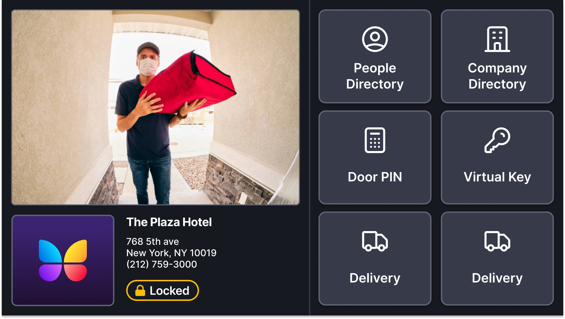
An opportunity to redesign our flagship product with a more reliable and scalable intercom experience.
Overview
The smart video intercom is the flagship product of ButterflyMX and what they are best known for. After assessing our fleet's performance and durability over time, it became increasingly clear we needed to address reliability across our current and future fleet of intercoms. We set out to improve our intercom experience in terms of connectivity, performance, and usability.
Priorities:
Fix unreliable legacy software
Address outdated hardware
Solve for the poor UX and UI of the experience (our focus)
The Problem
When I caught wind of project monarch during a weekly product meeting, it appeared that it was already decided that in addition to exploring new hardware and software options, the user interface would be implemented as a 1:1 match.
I questioned product why we wouldn’t take this as an opportunity to elevate the experience and address the usability and consistency issues that plagued our system. Product had taken the stance that design would be a bottleneck and add delay to the build and release.
Opportunity Strikes
Raising it got us a meeting with engineering on level of effort. The answer changed the project. Because the UI had to be rebuilt from scratch on the new stack, there was nothing to reuse. A one-to-one copy cost the same as a better one. Zero additional engineering cost. And the hardware and OS were not yet confirmed, so there was time to do it right before development could start. That took the bottleneck argument off the table, and we had 1 week to show/prove that the changes were worth addressing.

Challenge
We had 1 week to gather our design feedback to share during an intercom stakeholder review meeting. Our goal was to bring awareness to the issues in our system and the reality of our current UI.
What We Did
Heuristic evaluation (1 week) and present findings in stakeholder review
Determine components required across screens, divide and conquer on designs (2 weeks)
Feedback reviews with users, stakeholders, and other teams (1 week)
Work with Engineering to hand off and VQA (2 weeks)
Heuristic Evaluation
The goal was to make leadership see the system the way residents saw it.
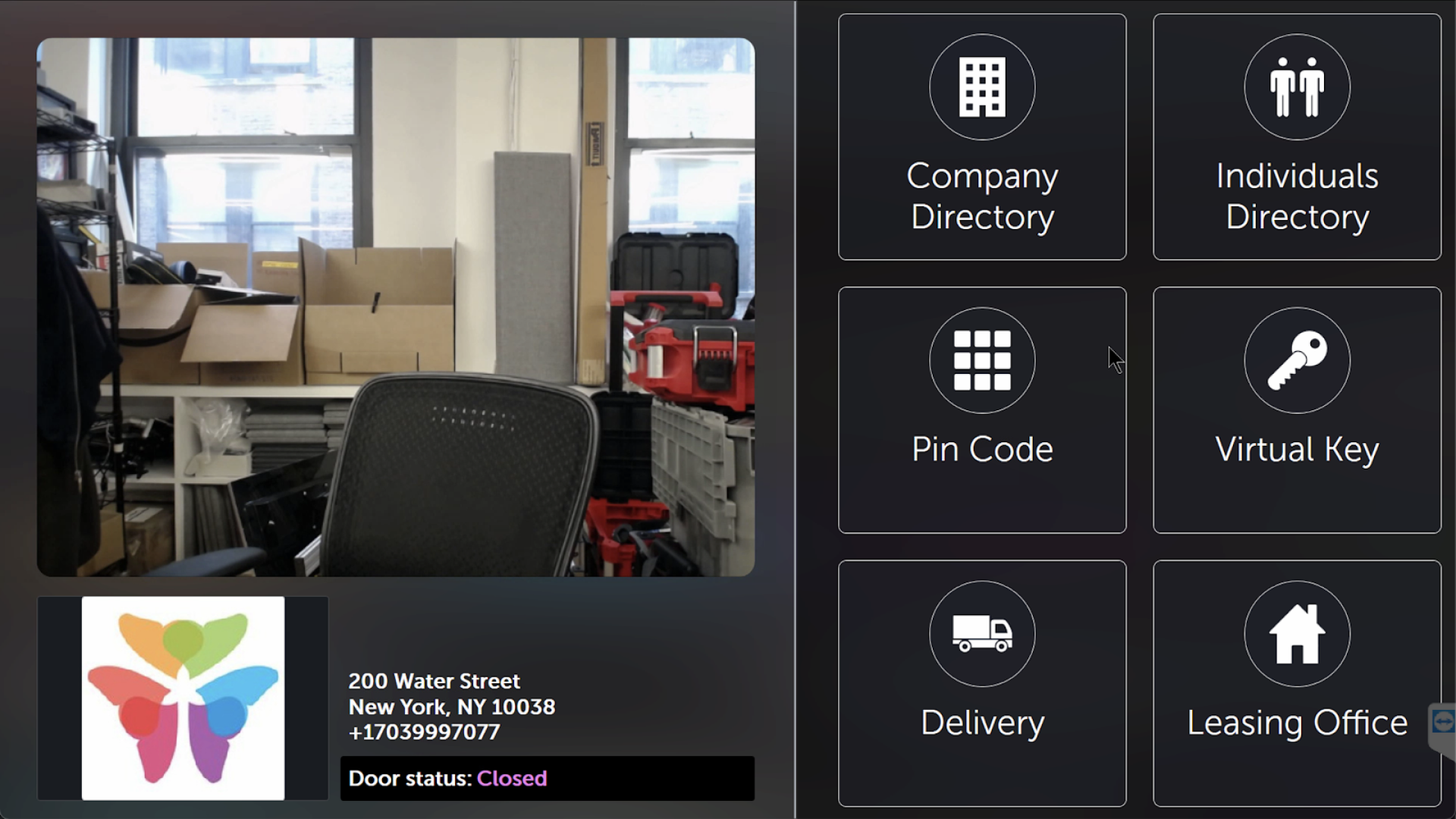
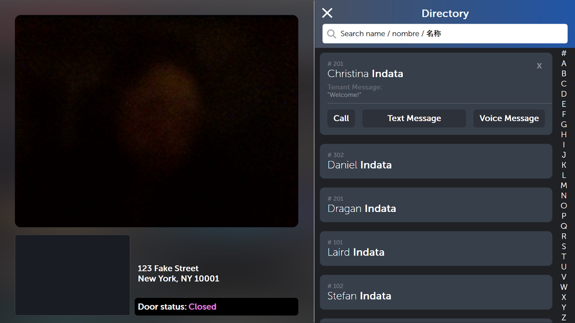
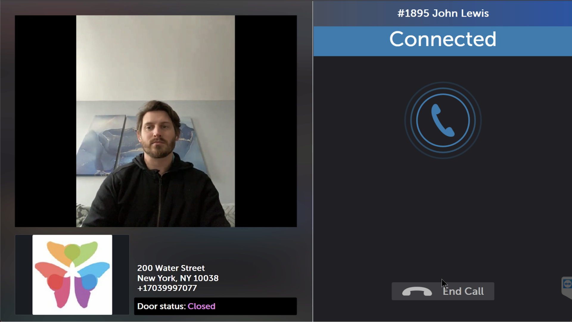
We laid out every current intercom screen and reviewed them as a group, adding comments against usability heuristics. The list was long, with over 40 comments and issues identified.
Issues
Color contrast
Font size and consistency
Component consistency
Alignment and usage of space
Icon styling and size
Poor system status visibility
Complex steps for simple interactions
Review
In the review I walked leadership through it screen by screen, calling out each place we felt could be improved. The case held. We got buy-in to explore a new, reasonable UI, with the understanding that everything would be scoped against level of effort before it was final.
Next Steps
Itemize all UI updates based on panel feedback session
Create mocks of proposed changes
Review mocks and prioritize (implement or not)
Scope changes based on LOE and requirements
Address any final design updates before finalization and handoff
Consult with Eng during development for clarity and VQA
Ideation
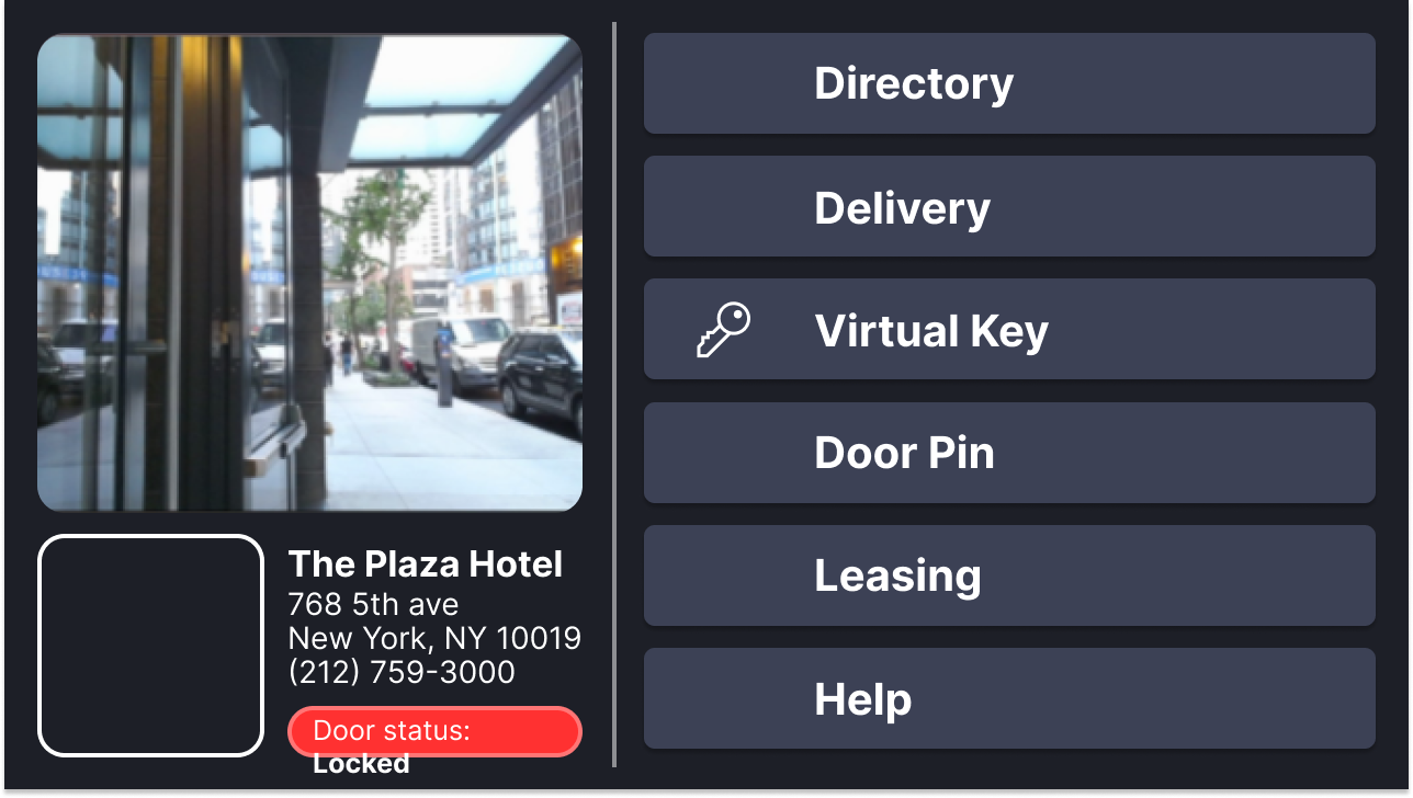
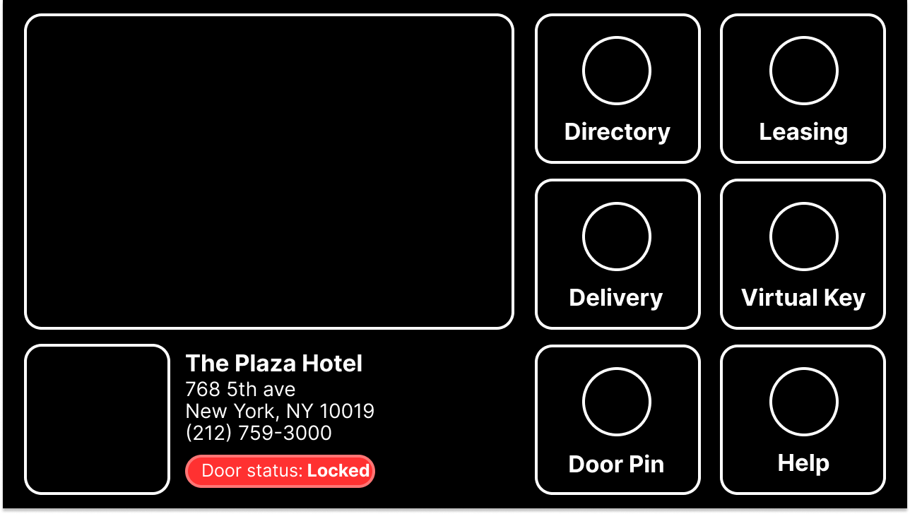
Ideation started with a mood board. We used the company values as the lens for evaluating styles, and explored layout, color, sizing, and type against our design system foundations so the intercom would not drift from the rest of the product.
Gathering Components and Defining Styles
Before anyone touched a screen, I had us identify every component across the intercom. That gave us visibility into what had to stay consistent while we drafted changes. I split the components across the three of us, we worked them independently, then came back together and agreed the final styles as a team.
Divide and Conquer Approach
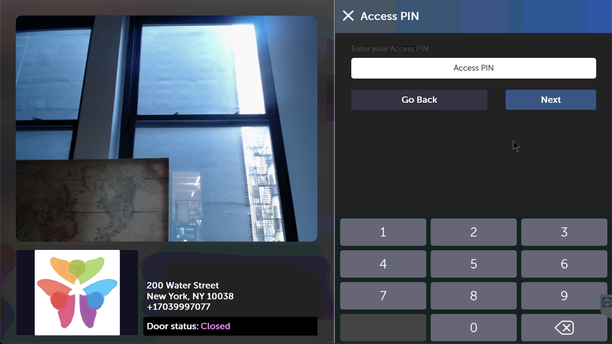
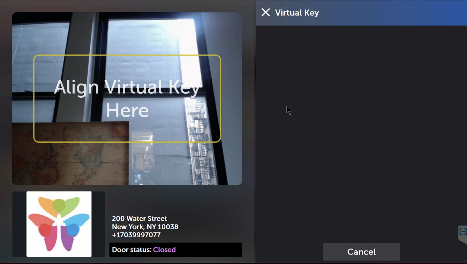
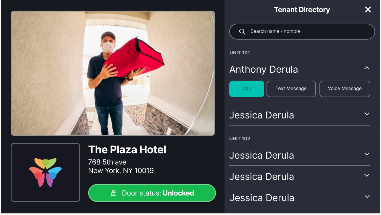
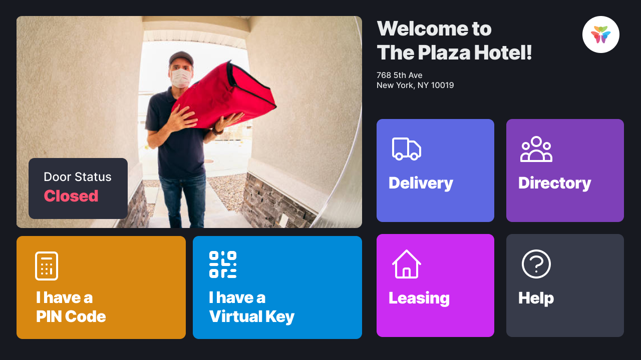
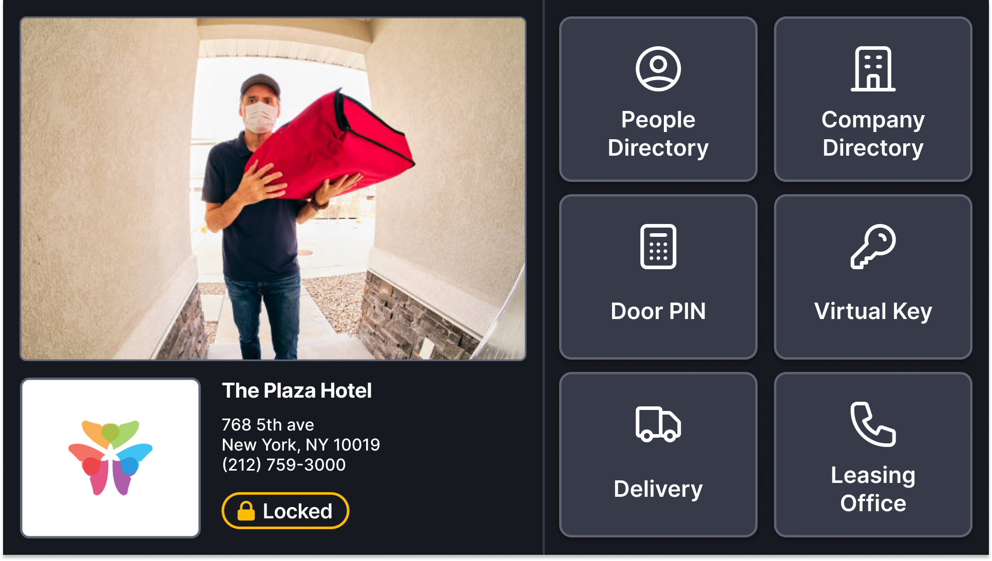
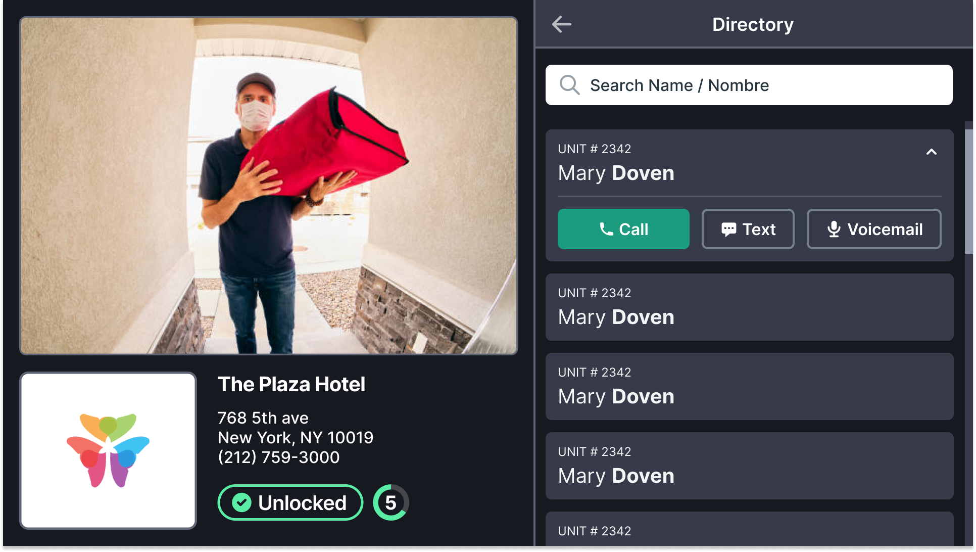
We took the same approach for the screens. I took the home screen and Making a Call. Anh took the Directory, Search, Help, and the Leasing Office. Yahya took Door PIN, Virtual Key, and Delivery. Yahya was a junior designer I was supporting, so I worked on his screens in tandem with him. Every screen went through a design review with the group before it went anywhere else.
Final Screens
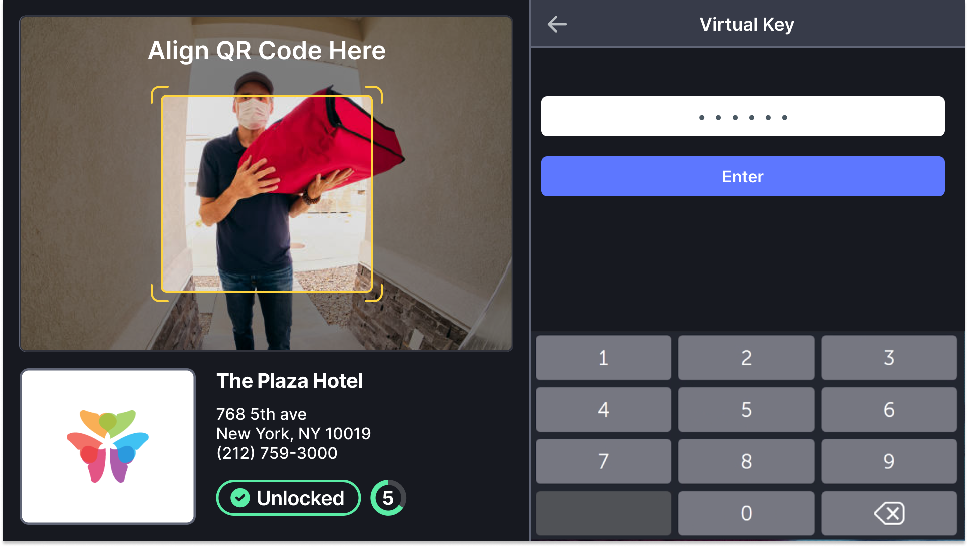
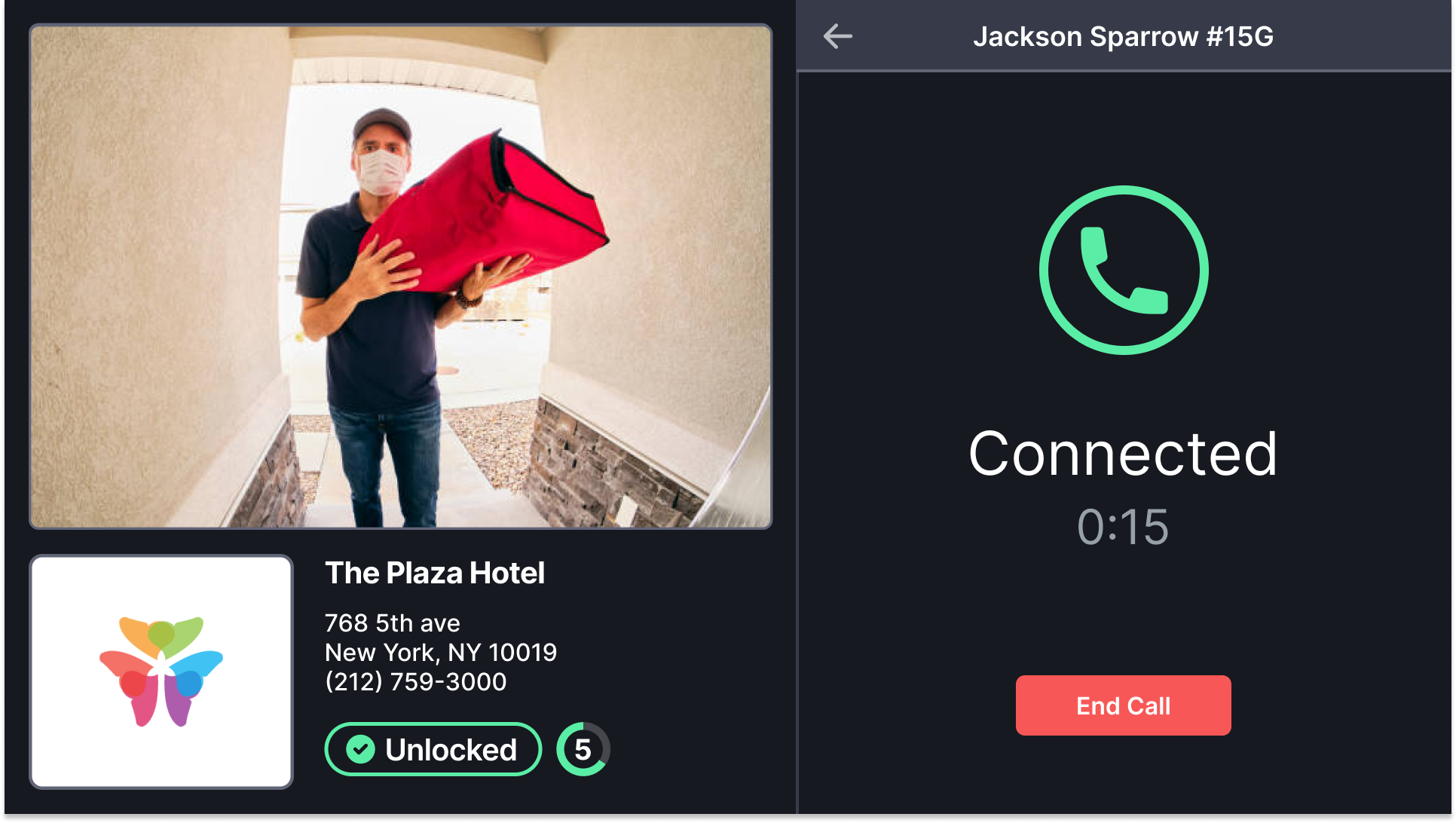
Leadership Review Outcomes
We addressed all the feedback and callouts during a review with Product and Eng leadership. They approved the final designs and we prepared them for handoff with a new engineering team. Engineering was involved in the feedback sessions and reviews which made the onboarding and handoff process a continuation.
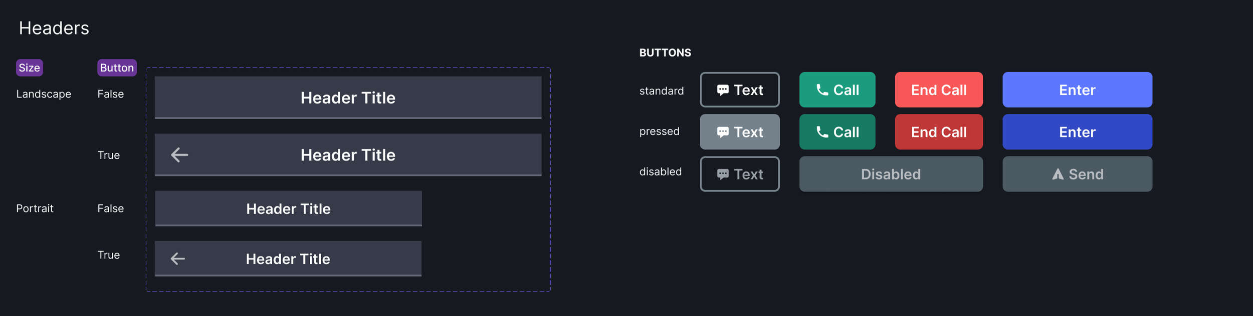
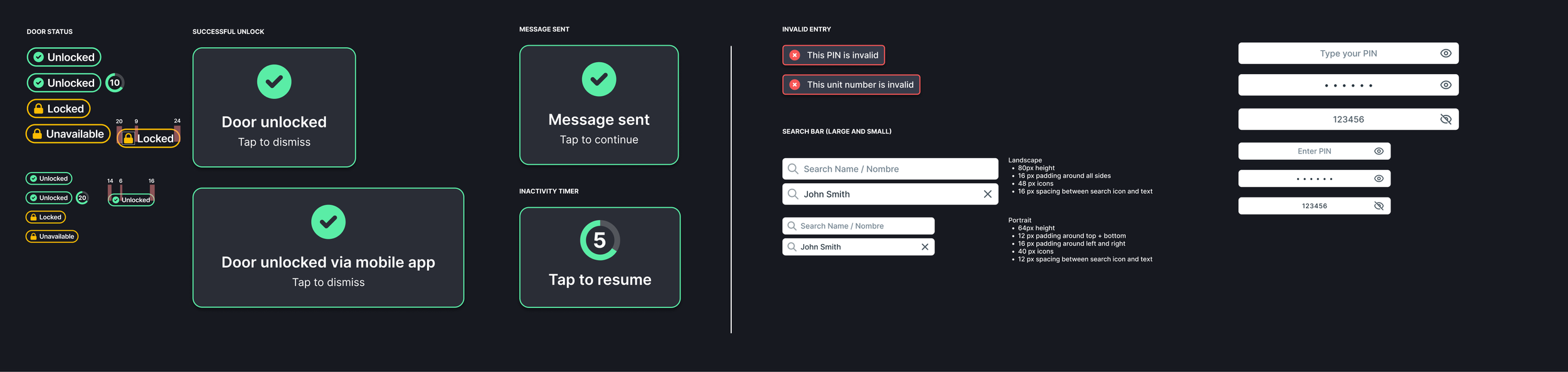
Addressing the Screen That Never Changed
Once the foundation shipped, we went after the item that had been briefly mentioned but not addressed. Screen burn-in was reported enough times it was common for the install team to see a support ticket for it, but design was blind to it until they told us during this project.
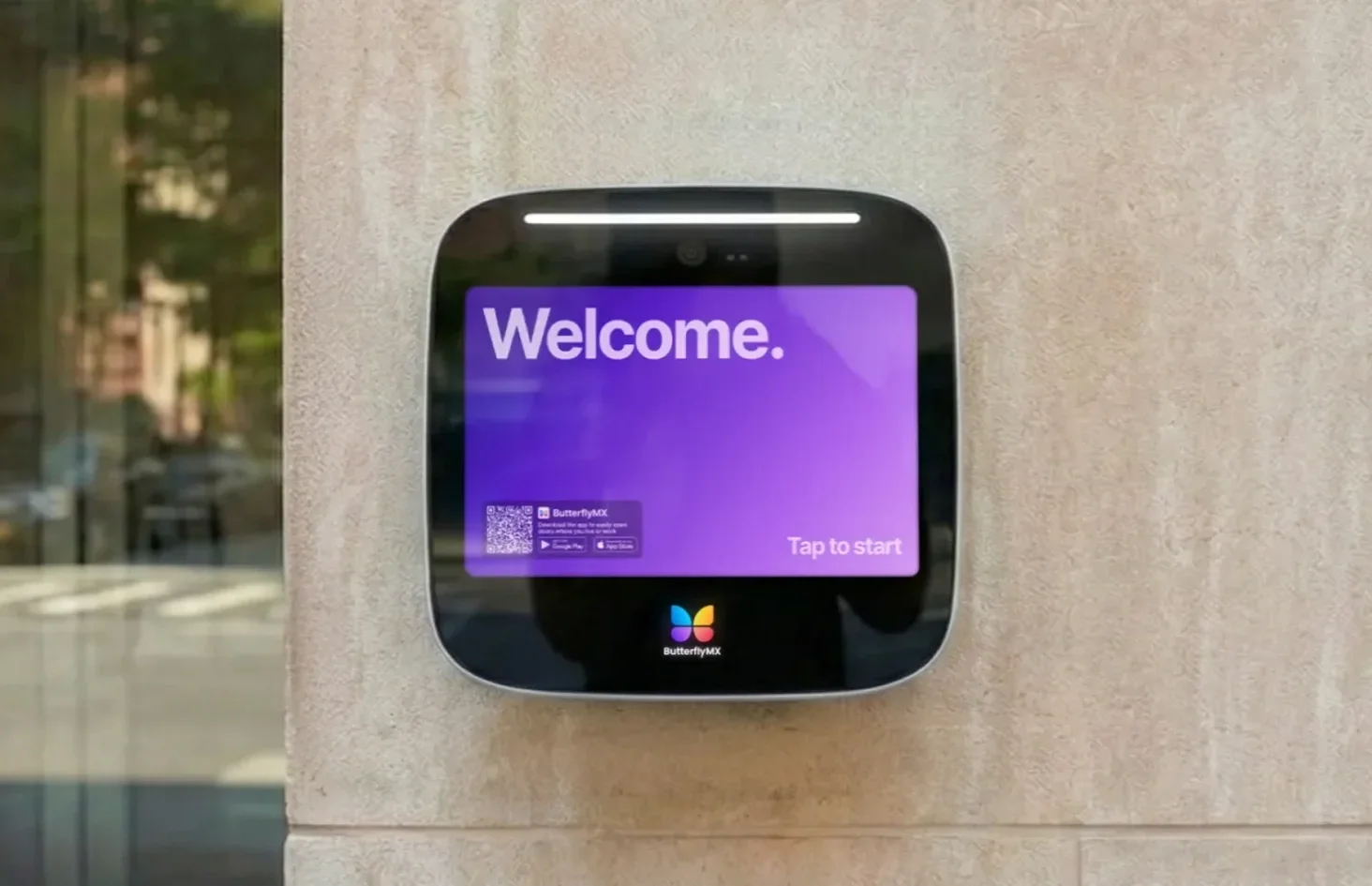
An animated welcome screen replaced the static home screen. It eliminated the burn-in and gave the panel a resting state that read as deliberate rather than abandoned. It became the signature thing you see when you walk up to a ButterflyMX building.
Impact
Screen-issue support tickets across the fleet dropped 24% in first 6 months. (Roughly $80-100K in installer costs saved)
Established a New Monarch style guide we used when it came time to design and adapt for the smaller 7” intercom
New Design QA process with engineering and product that informed our continuity and collaboration post-handoff.
8-phase rollout reached 5,166 (roughly 99% of fleet)
It changed how I approached a project that said “design was a bottleneck” or “not needed”.