
For the core experience, check out my prototype walkthrough here!
PROJECT OVERVIEW
I was given the task of designing a e-commerce site for Paragon Sports that satisfied the needs and goals of both the user, brand, and business. Site will follow IA heuristic (best practices) and will not have advanced search finding capabilities.
CHALLENGE
To create an e-commerce site that reflects the in store experience while maintaining a well organized system for categorizing the many items they carry. The goal being to keep the navigation simple, make products easy to find, and make the site easy to use.
RESEARCH AND ANALYSIS
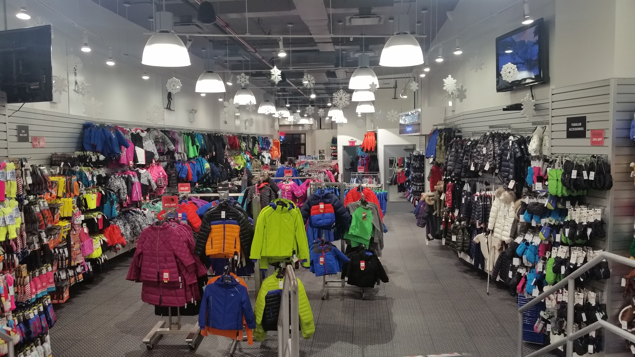
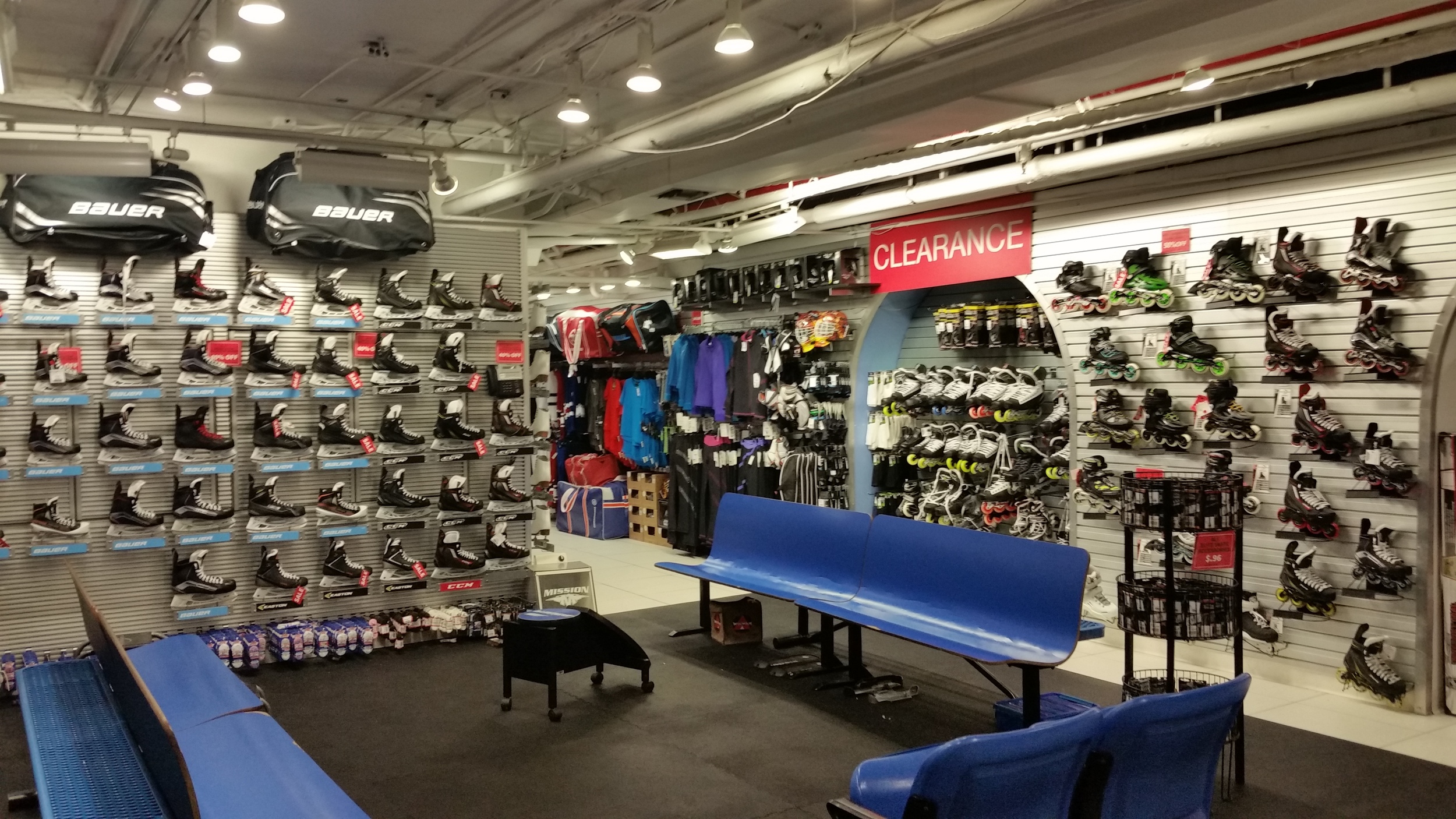
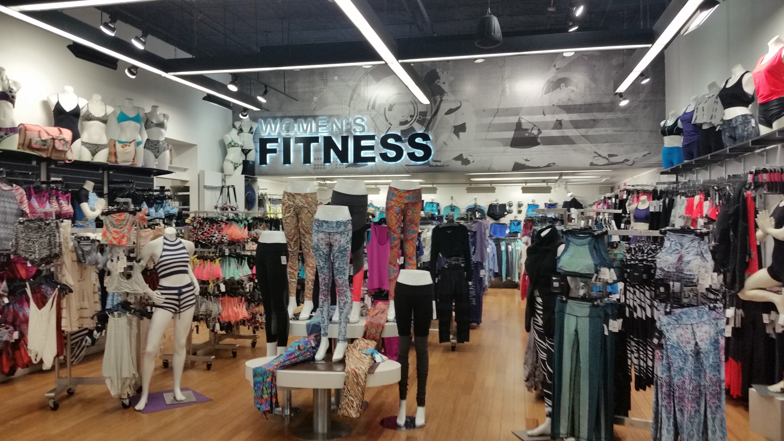
Contextual Inquiry
Offer an array of products to cover a range of sports and active needs.
Provide optimal customer service and specialized product knowledge to consumer.
Brand driven and diverse.
Internationally recognized for reputation in quality and service.
Interviews

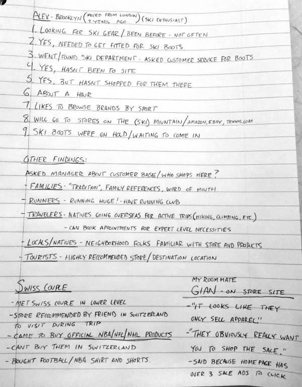

“They have the biggest variety.” -Louisa (first time snowboarder)
“The help here is a big draw, otherwise I would just buy on amazon.” - Matthew (hockey dad)
“Ive been to the site but just to browse, not for shopping.” - Manny (baseball player)
Key Takeaways
Customers like to browse the content
Come for customer service and expert product knowledge
Most are not brand specific
Average 30 mins. in the store.
Most customers are NYC natives familiar with the store.
COMPETITIVE ANALYSIS
Product Discovery and Navigation
I evaulated 4 competitors, looking to understand the commonalities in their navigation options and understand the task flow from home page to a specified product detail page.
An average of 4 clicks to locate a specific product
Most common nav categories: Clothing, Footwear, Sports and Outdoor, New Arrivals, Brands, Sale
Further testing would validate the success/failure of categorization taxonomy

Heuristic Evaluation
I ran a usability test of our competitors on common features that proved to be important to our users. I rated them based on findability and ease of use. I needed to understand how well users could potentially navigate a site for a particular item. Dicks Sporting Goods was most successful in usability despite the look of their interface.
Most Common:
New Arrivals
Contact Page
Sale Page
Related Products
Multiple Product Views
Search by Brand
Product Reviews
Social Media
INFORMATION ARCHITECTURE
Card Sorting
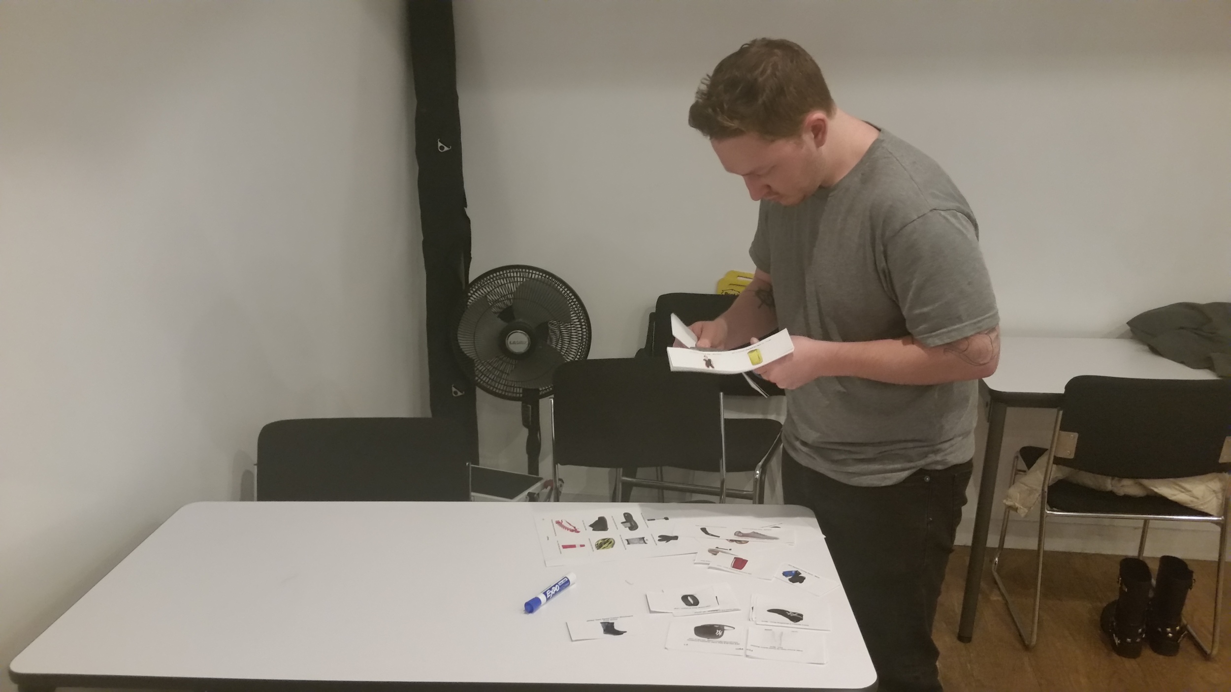
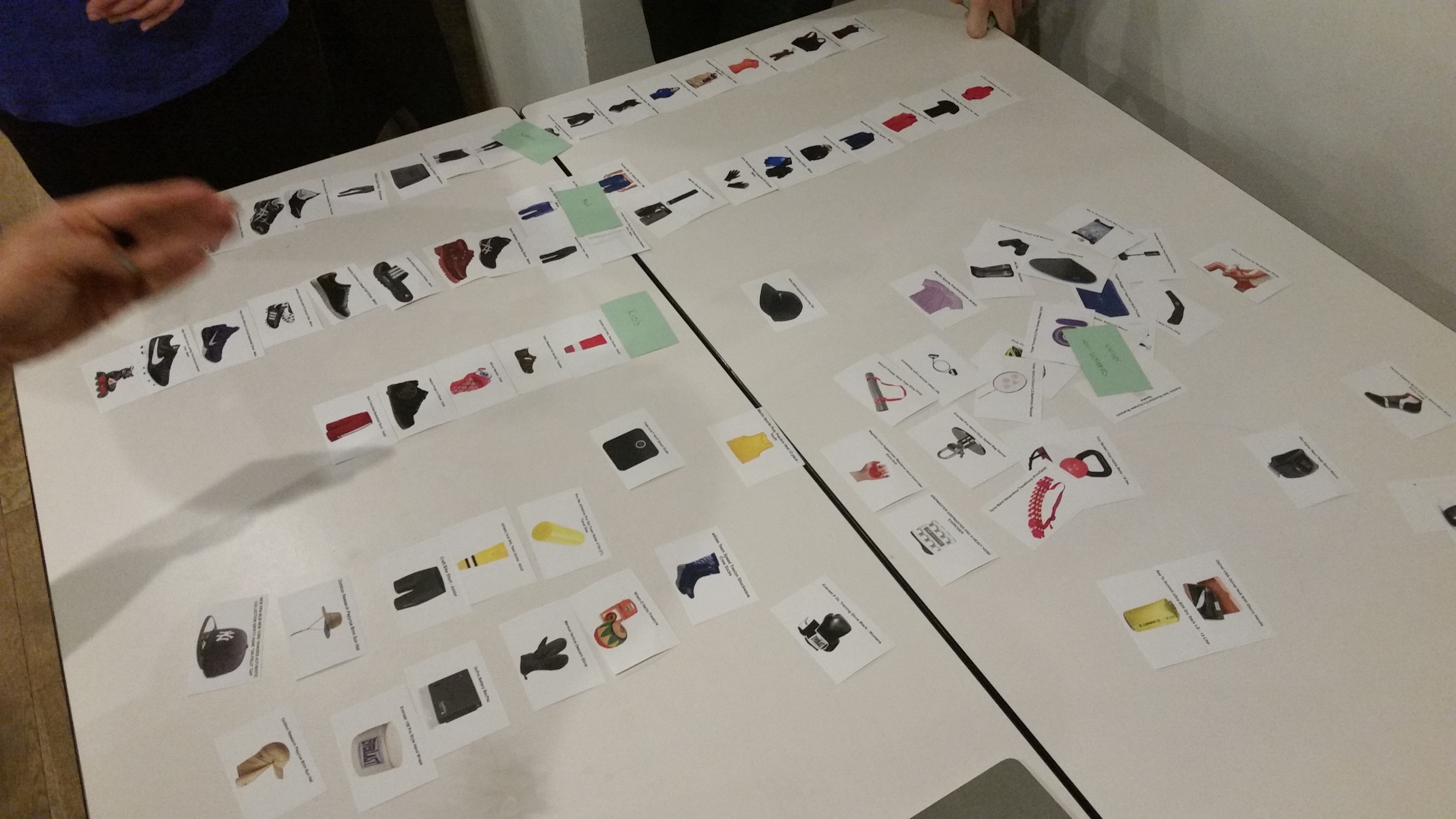
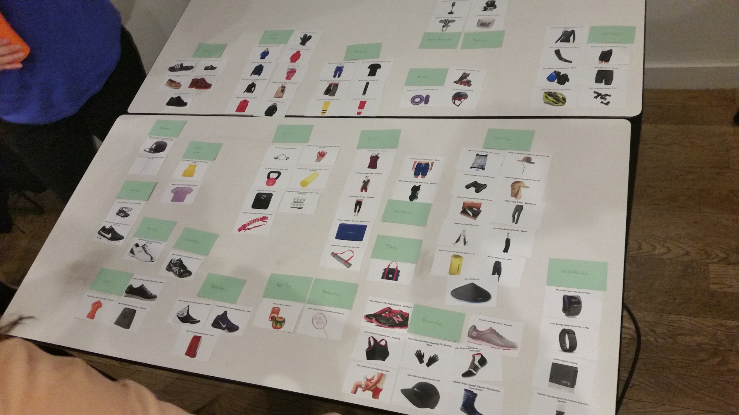
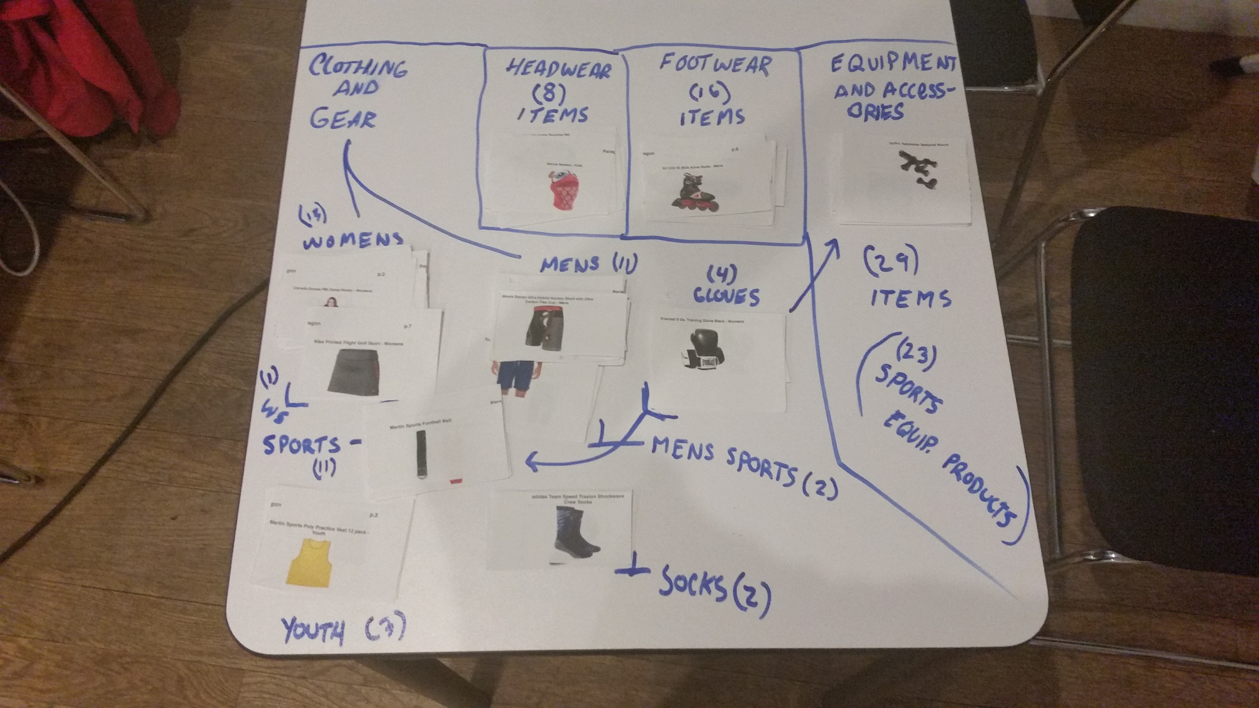
With a 100 products to sort and categorize on the site, I conducted a few card sorts independently and in groups to determine which potential navigation categories made sense. My goal was to reduce the amount of nav options so that it wasnt overwhelming and users could find products quickly and easily.
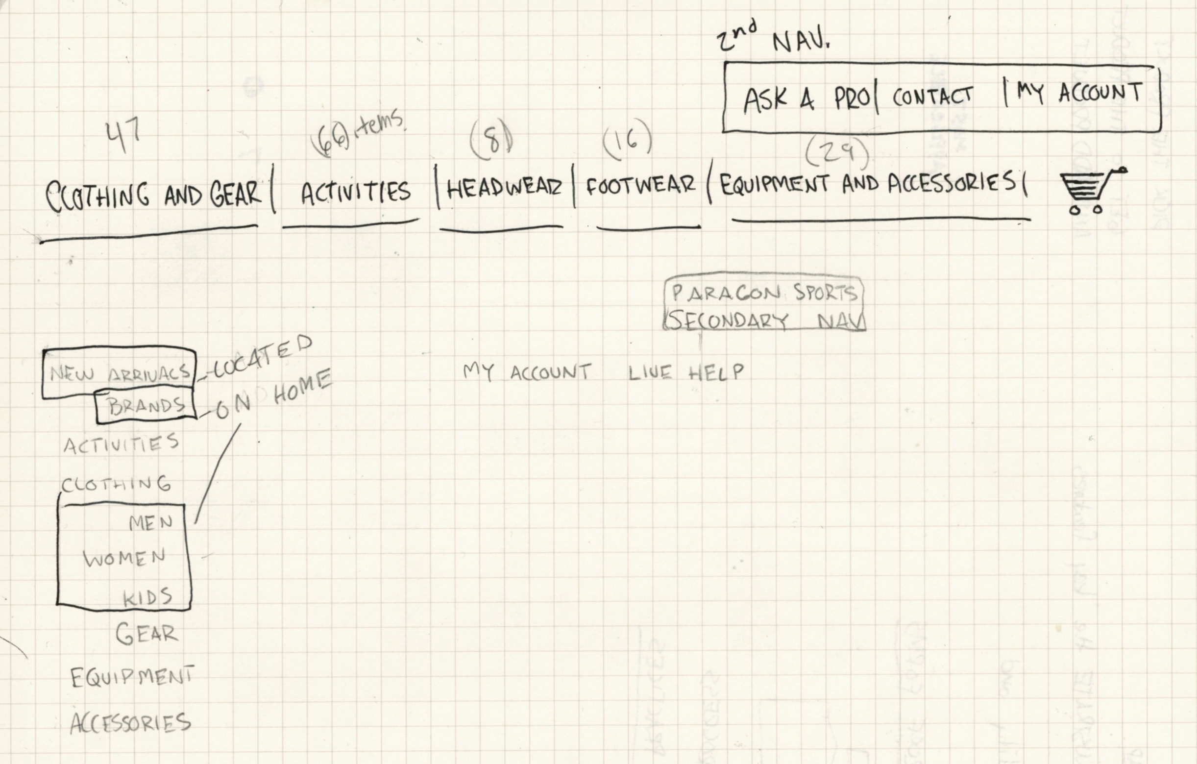
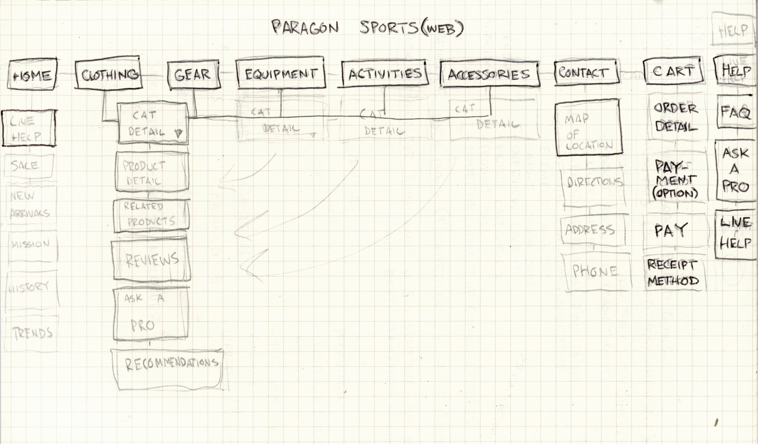
Site Map
I started with a navigation based on my initial findings from research and card sort. I then tested my potential navigation by asking users questions about the categories and what they thought they meant. Some of my initial options were confusing, so I iterated until they made sense.
PERSONAS AND USER FLOWS
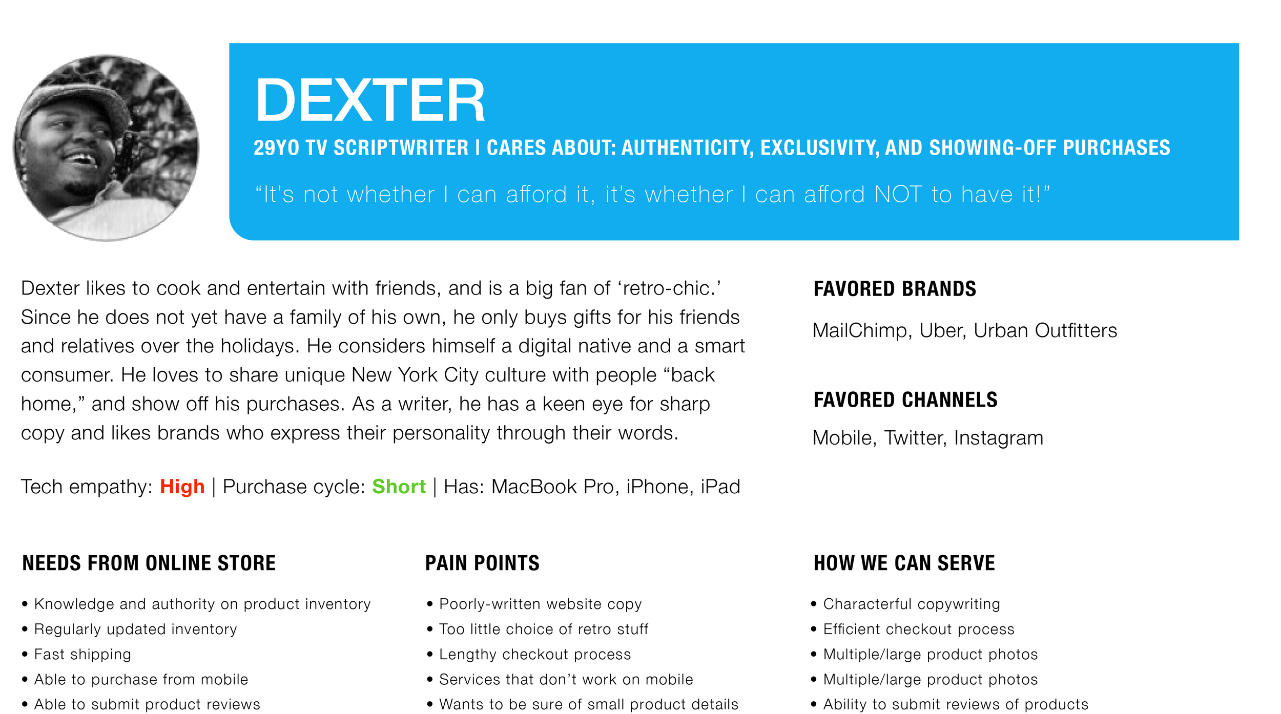
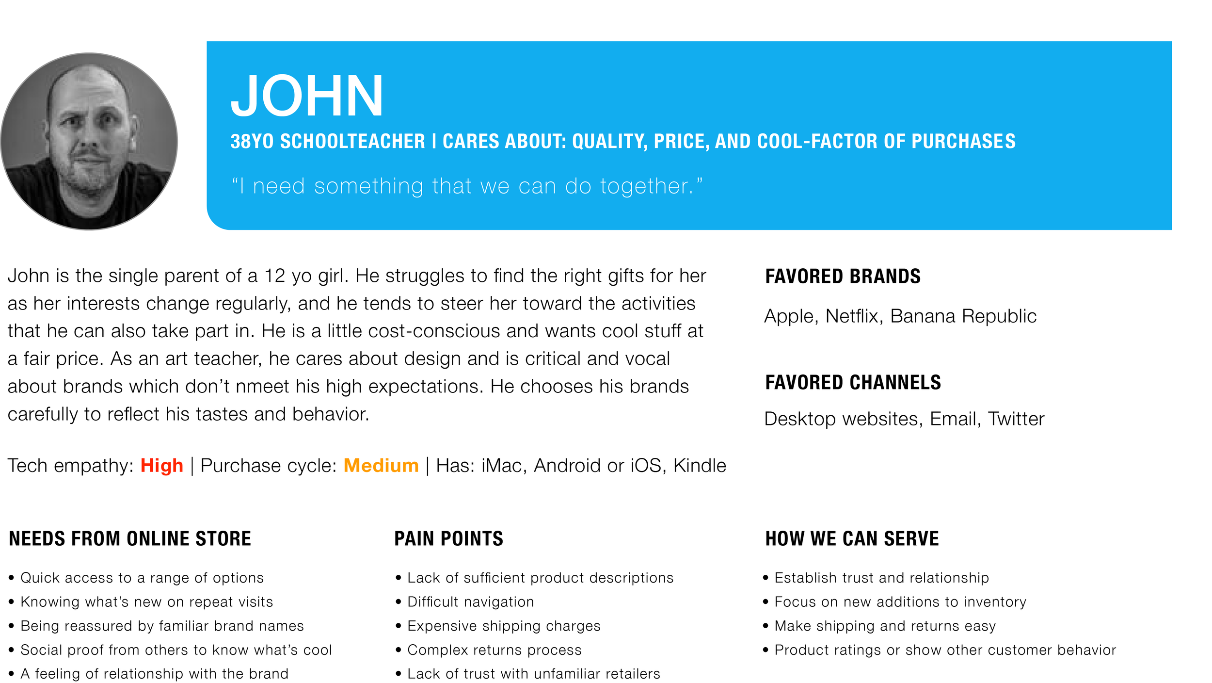
Personas
Of the 3 personas, John was the primary user. While considering how to design for John, I also wanted to afford for the other users. In order to provide a quality online shopping experience I assessed the needs of our users before creating my design solutions.
Needs
Product reviews
Most popular and trending styles
Expert product insight
Hassle free ordering and ship/return process
User Flows and Scenario
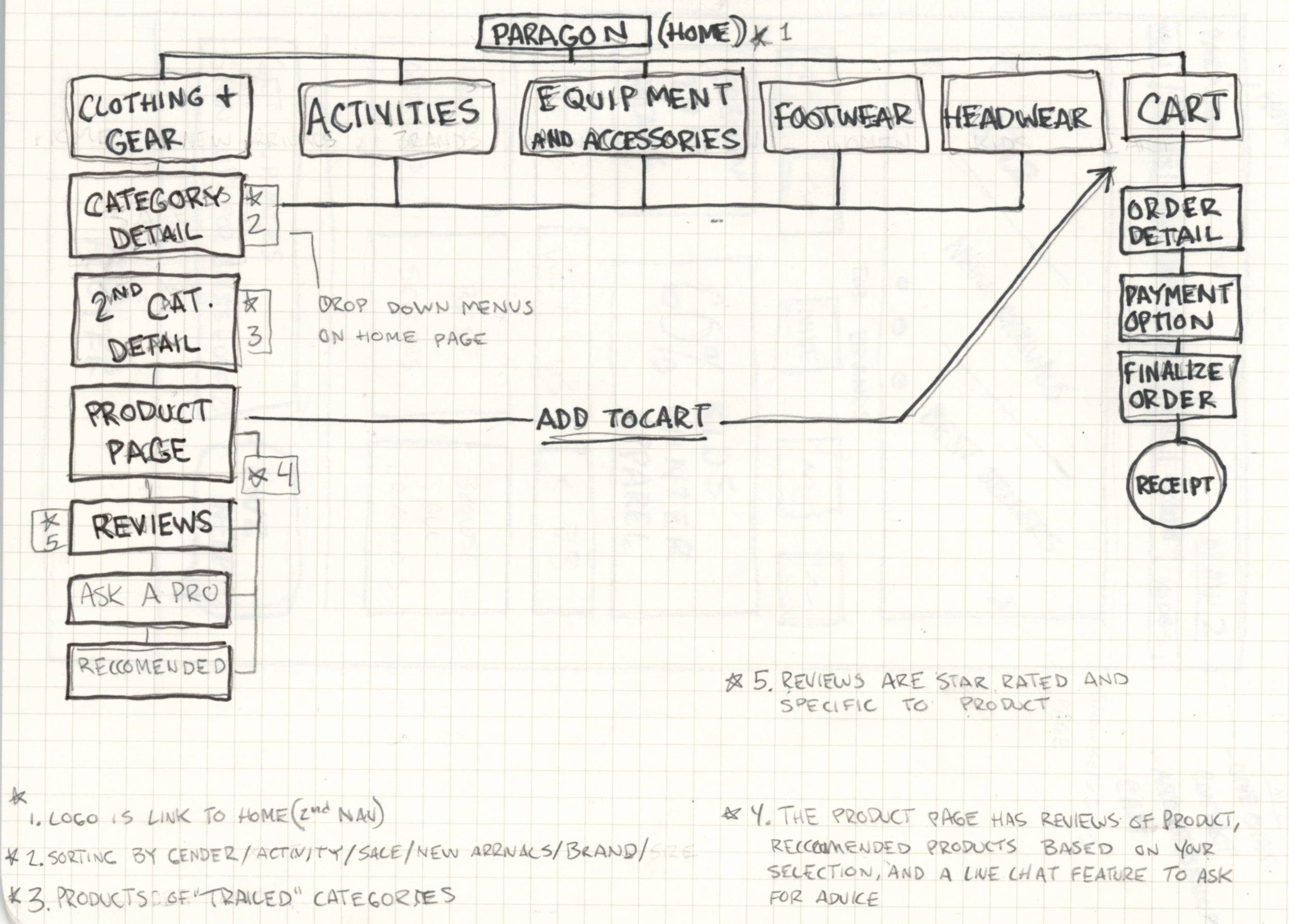
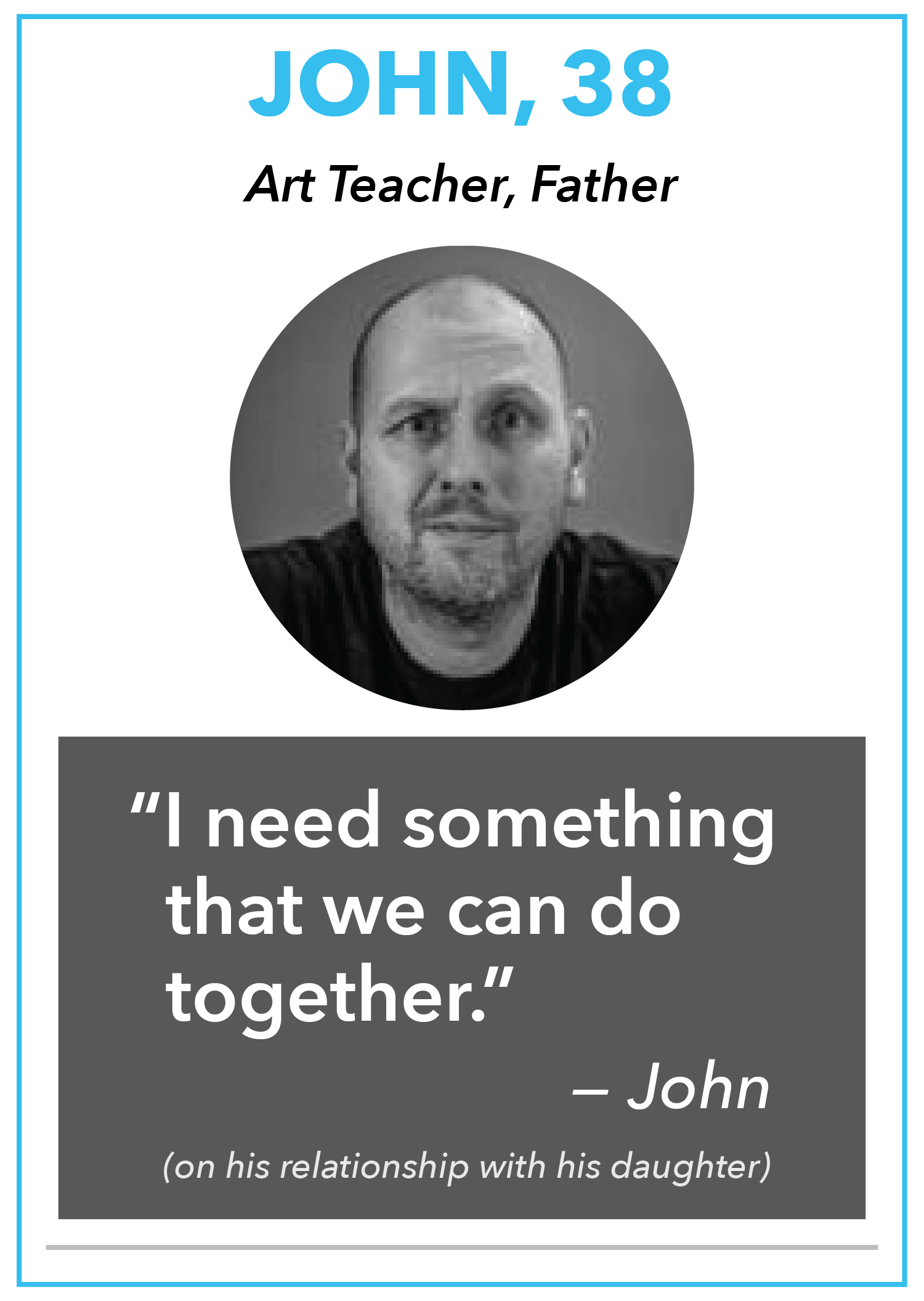
I had to consider how our primary persona was going to navigate the site and what his expectations were. I came up with a problem statement that defines Johns use of the site:
"As a Father, I want to easily buy ski pants for my daughter online so that we can go on a ski trip and do something together."
John's primary task is to find ski pants for his daughter, look at product reviews to assess quality, and checkout.
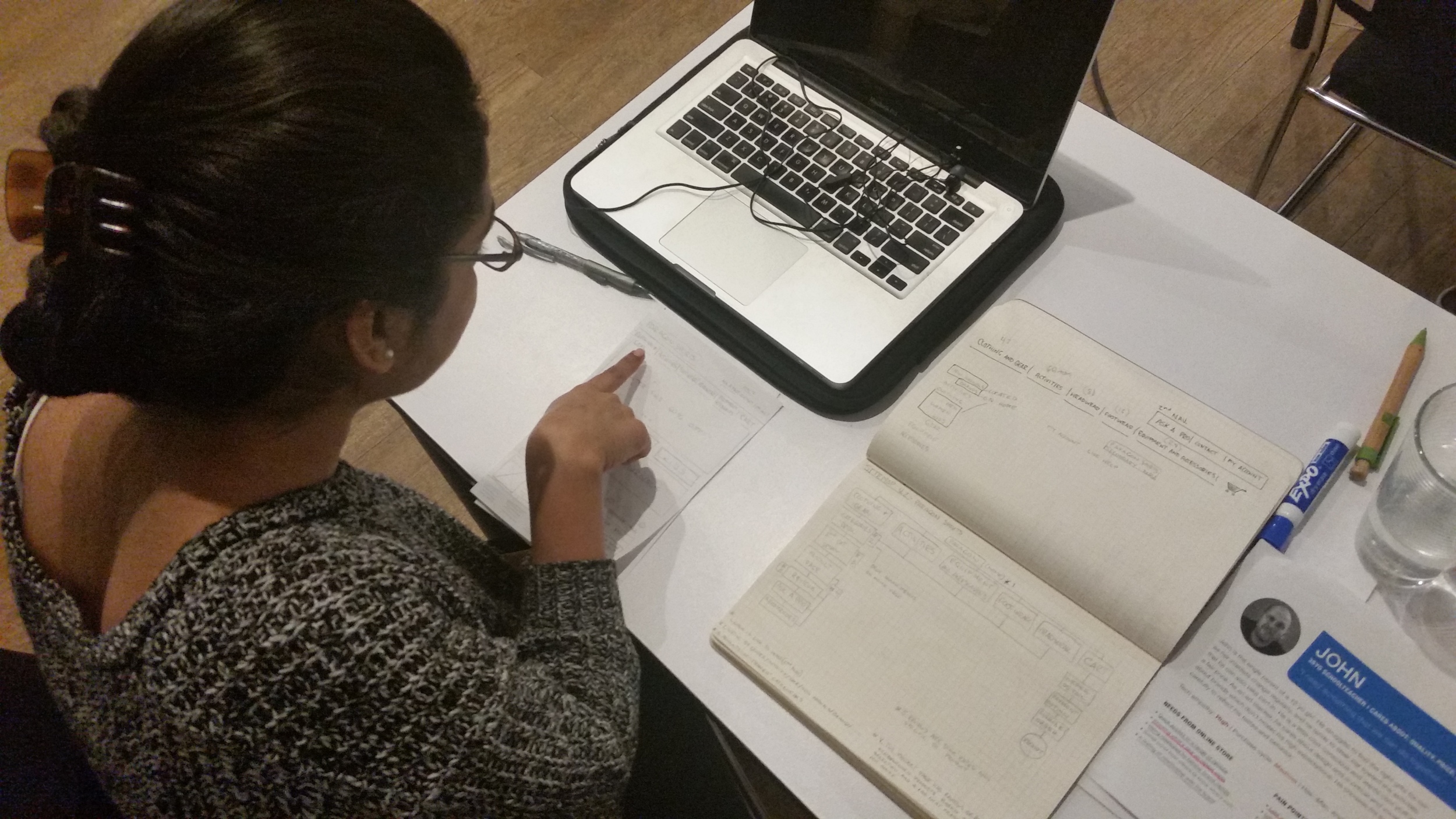
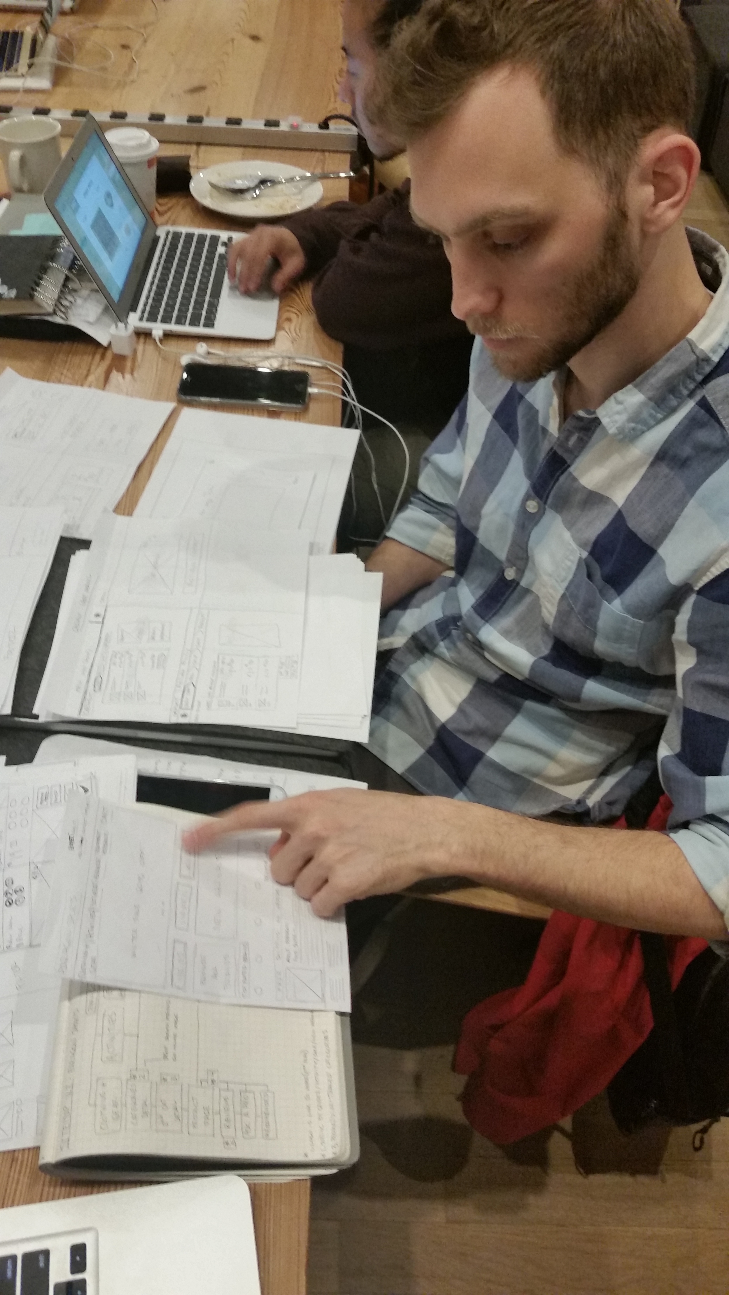
USER TESTING AND INITIAL WIRES
These are some of my initial sketches for design and layout. I used my sitemap to test potential nav options and used my layout designs to test what made sense on the home, filter, and product detail pages.
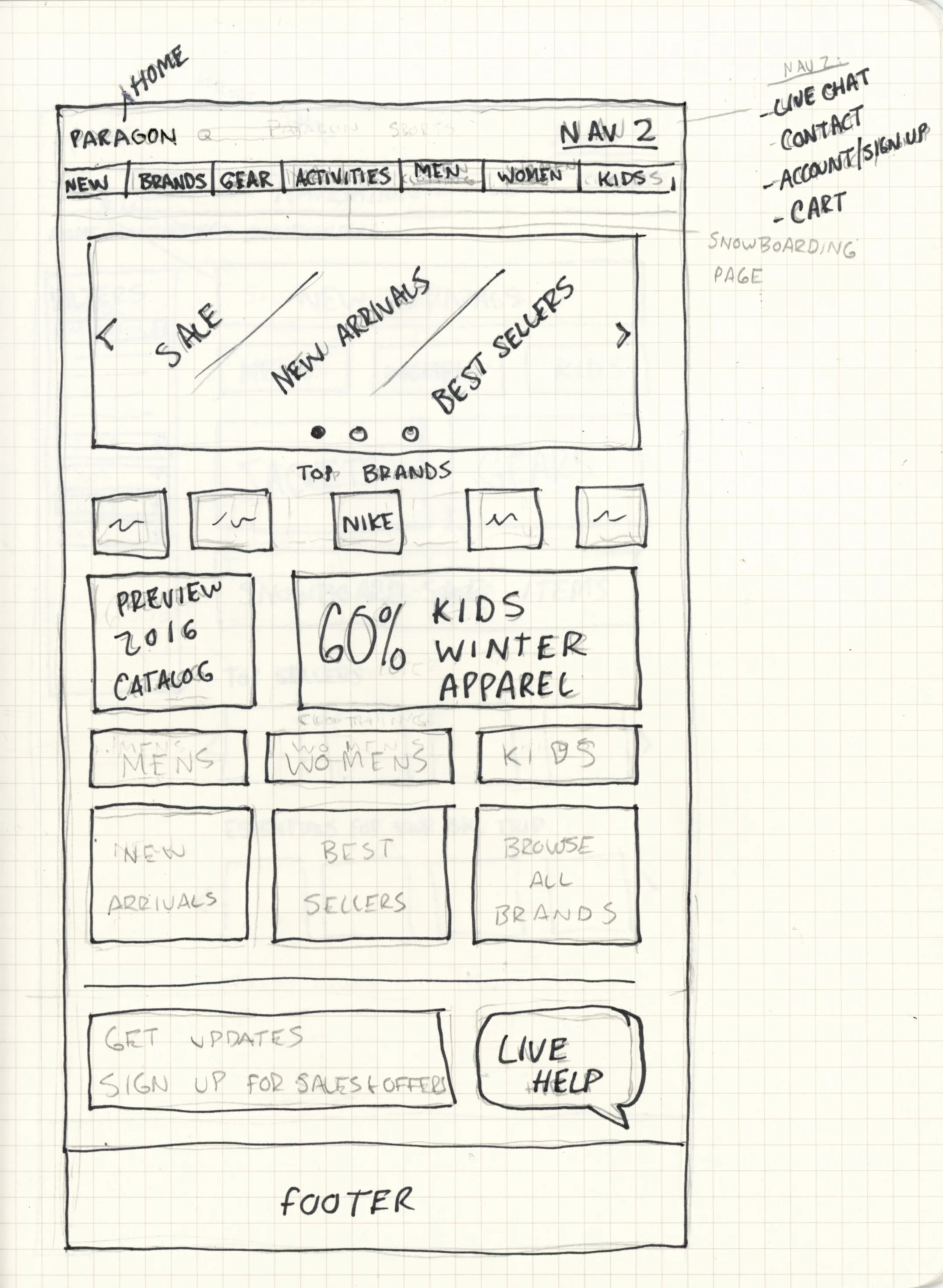


Taxonomy and Labeling
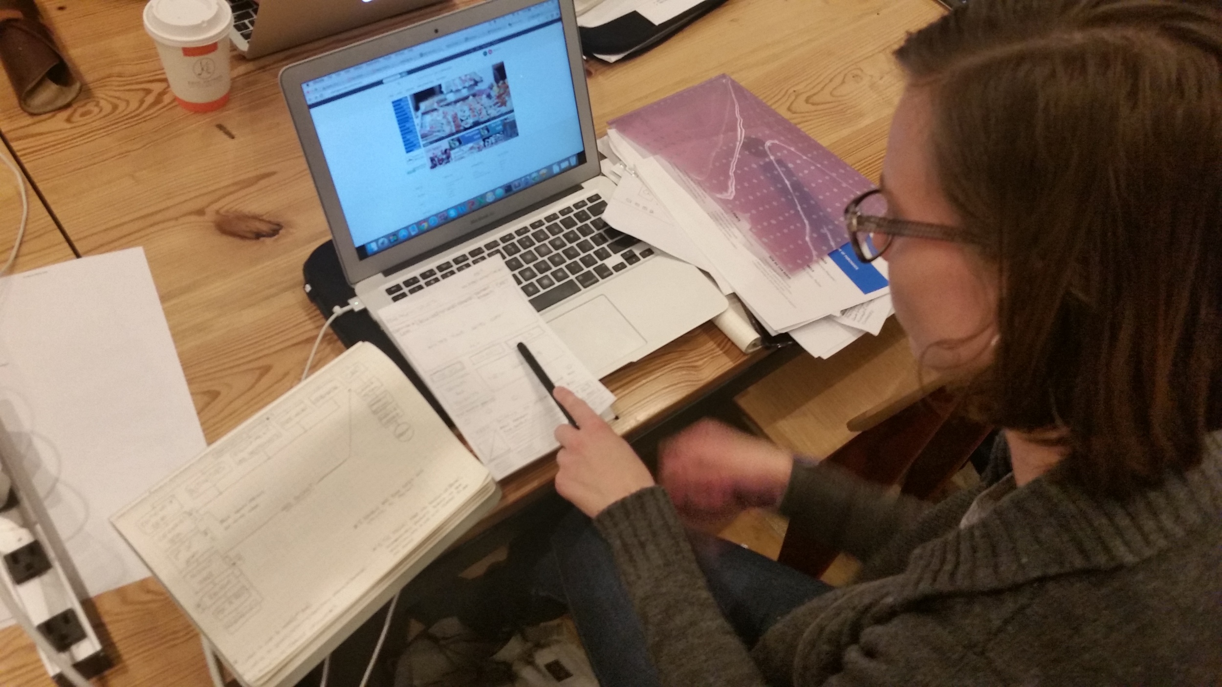
I took initial design solutions that I sketched out and began testing the concepts to see if they made sense. I tested with several people who had difficulty navigating options as per my task, I was fighting with how to filter categories and how to even navigate the first categories page. I began looking at my competitors from the first iteration, realizing the success of their nav options. I then made hi-fi wires and adjusted my designs based on my findings.
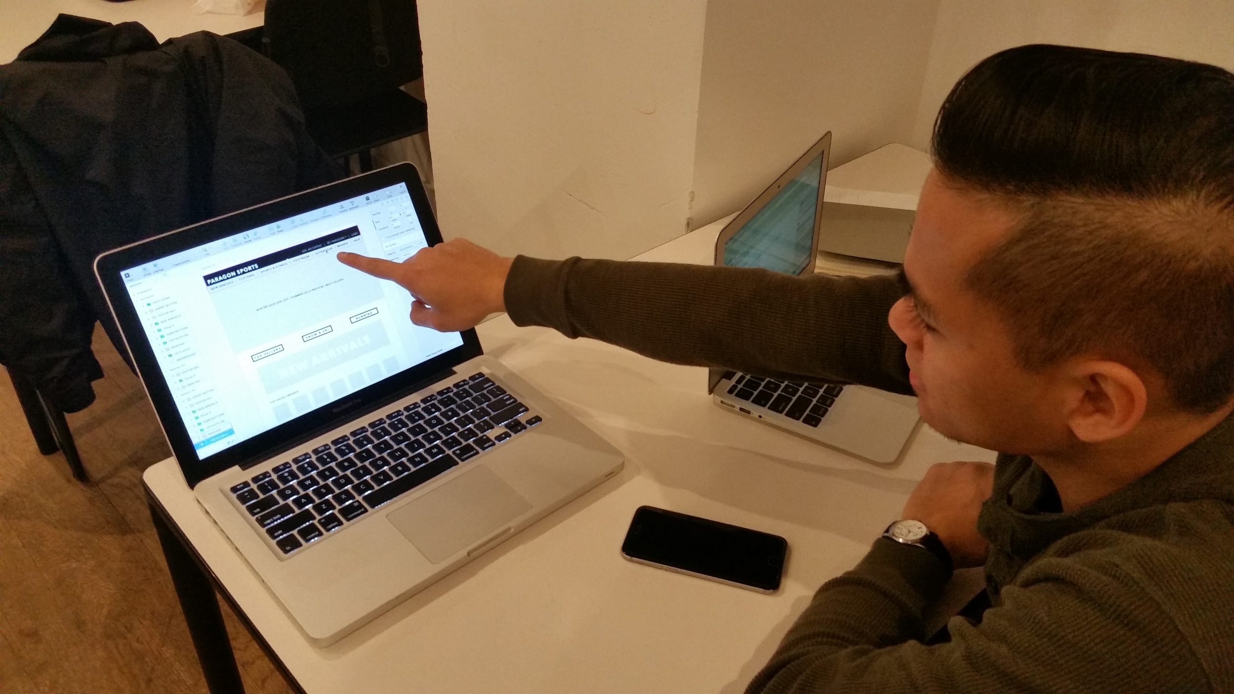
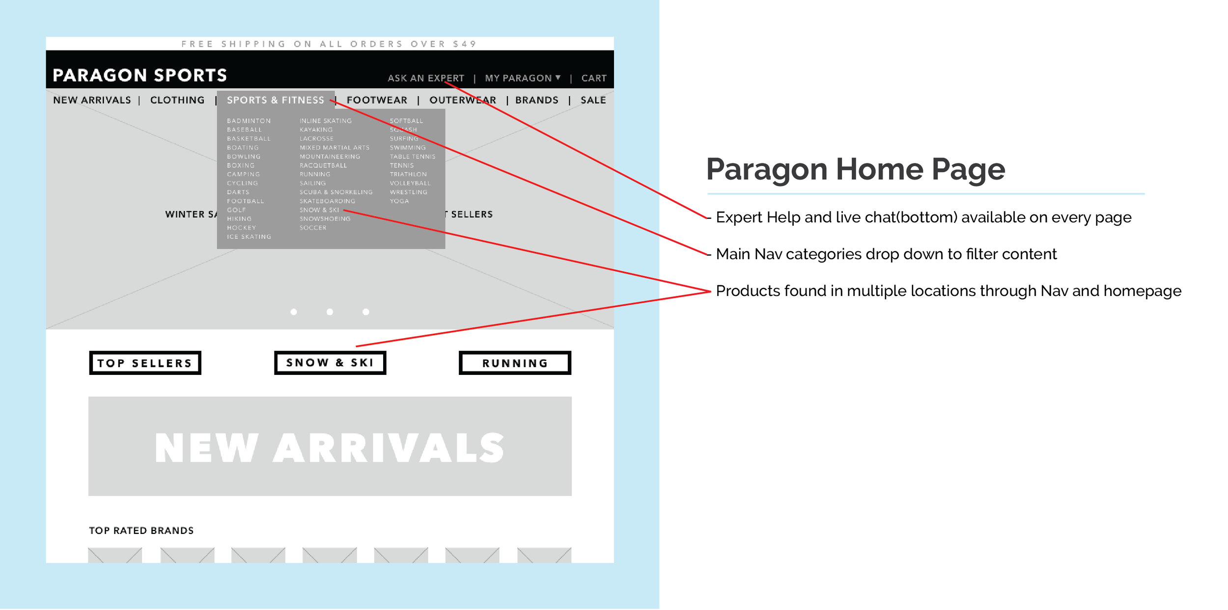
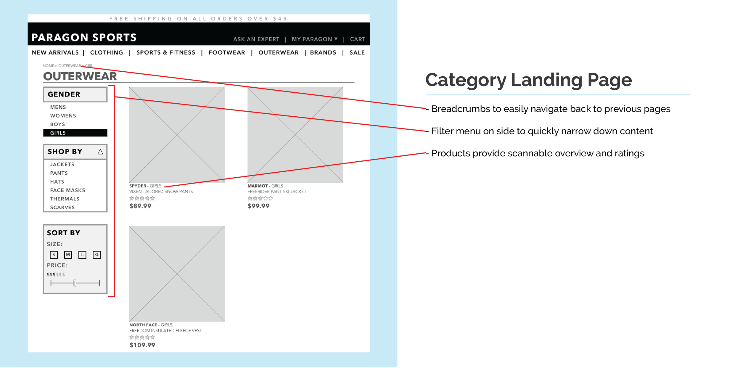
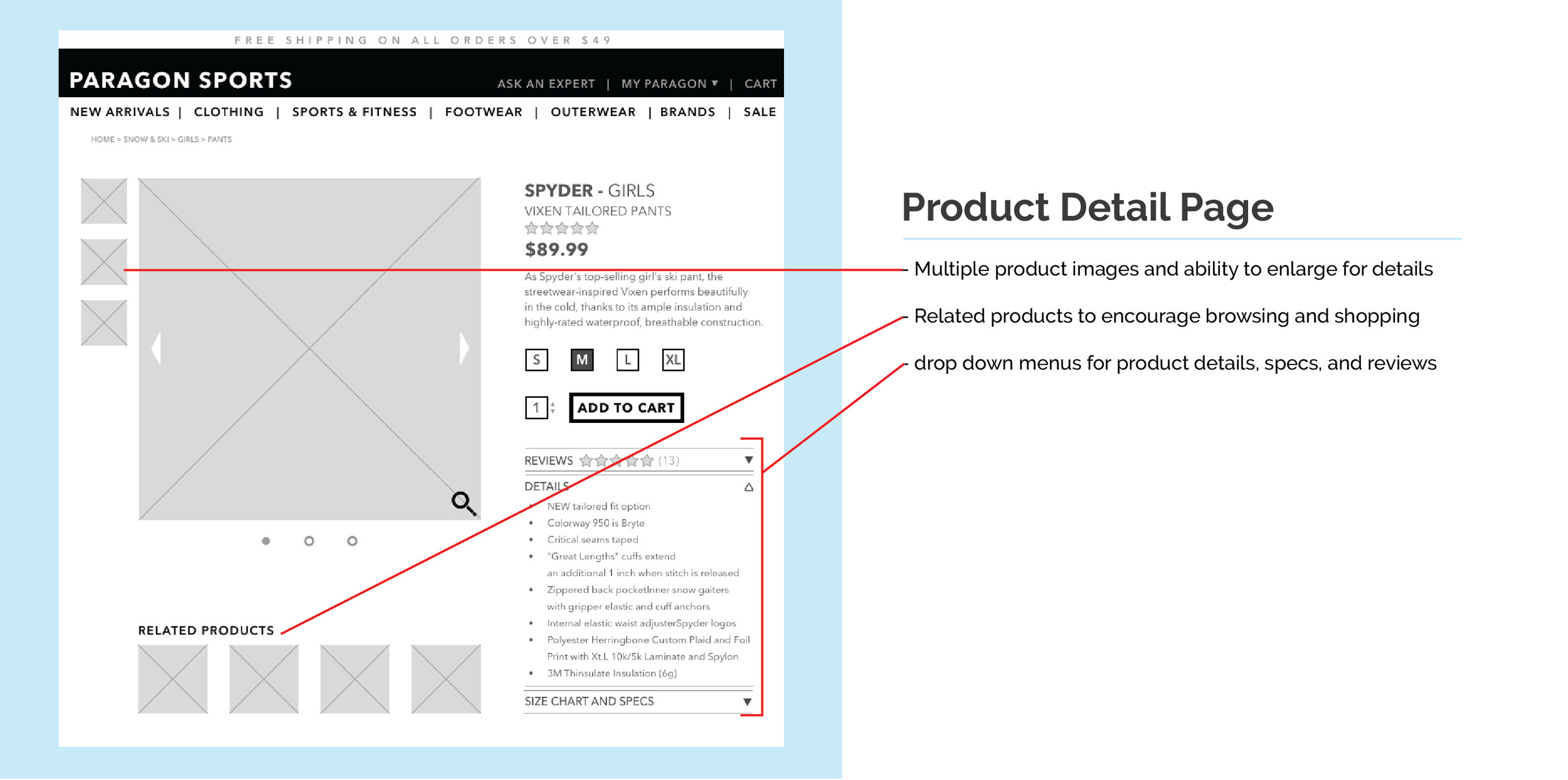
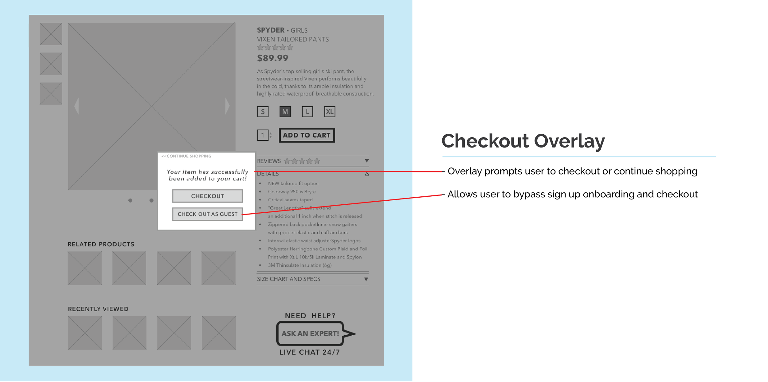
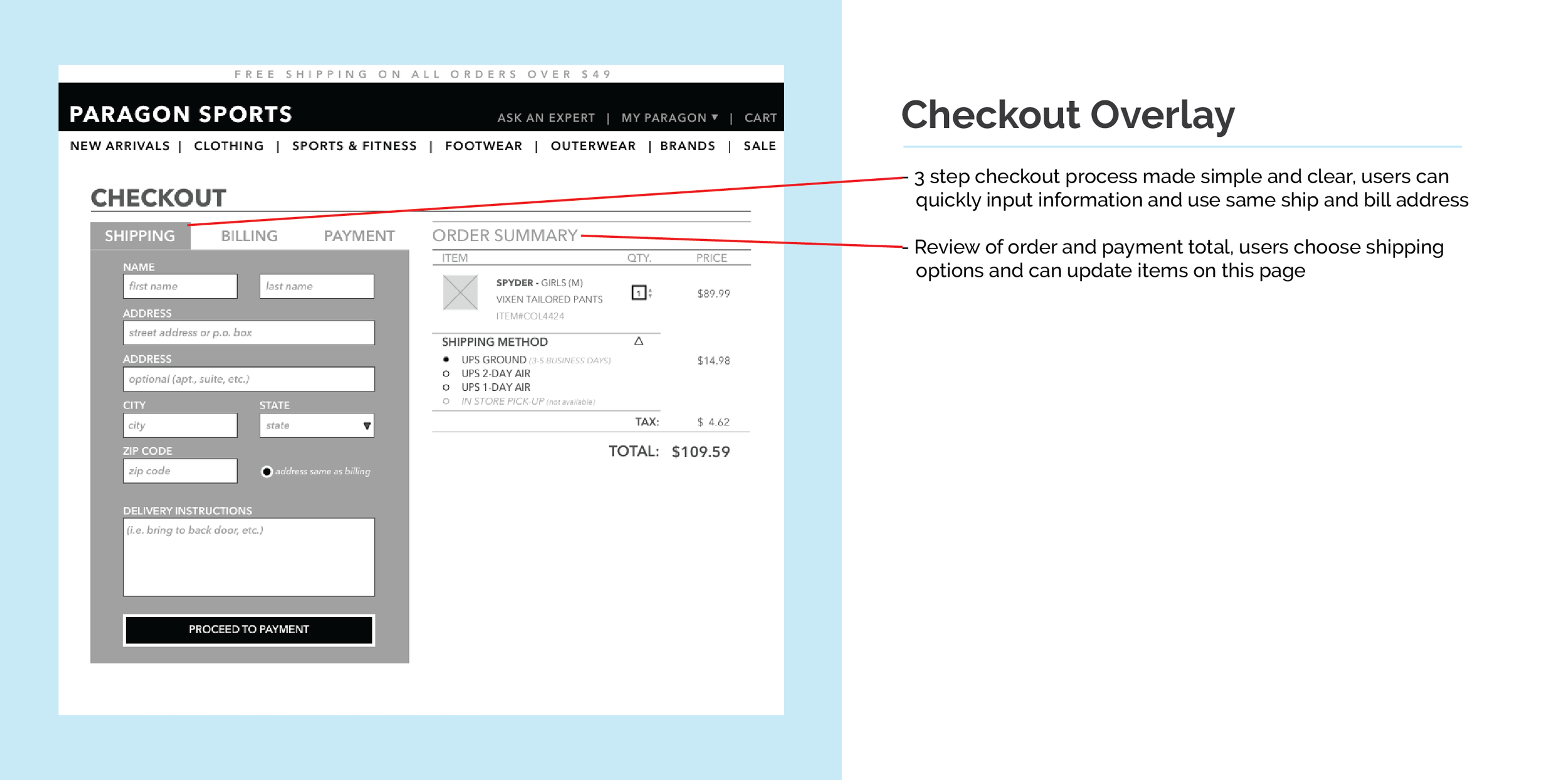
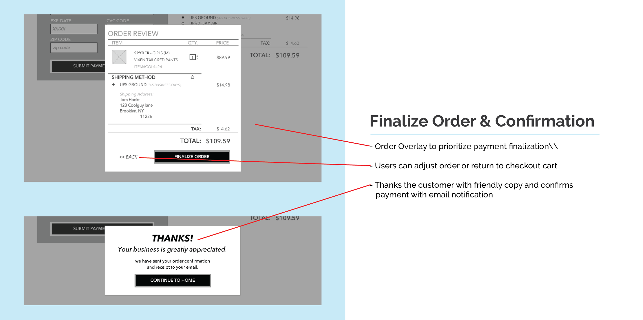
FINAL WIREFRAMES
FINAL THOUGHTS
To me its always important to do more testing and refining. What I learned was that determining the way content and information is structured is integral to the success of a site that has an array of products. Users need to be able to locate products seamlessly and without fail. My goal was to reduce or remove the number of errors one would make in locating products, and make the online experience similar in the way people learn or ask about products in store. Activating the compositional space will help keep the site from being overwhelming to users.