
Mobile App Evolution
Expanding our resident experience beyond just opening doors.
ButterflyMX is an access control technology company for multi-family properties that gives residents the ability to open their building doors remotely. We had an opportunity to expand our resident app beyond just opening doors to include other areas that would give residents a full building experience they could control from their phone, rather than being segmented across multiple apps.
Reserving amenity spaces
Requesting maintenance services
Building notifications
Payments
Community bulletin boards
Building information and support

Problem
The app wasn’t originally designed to support additional features outside of access.
Building access would always remain front and center, but the app needed to expand to support a broadening feature set for our residents and the buildings they live in.
We needed to re-architect the resident experience in order to create an intuitive way to navigate ButterflyMX content and features at the point of need — whether that need is building access, ongoing building operations, or smart-home automation.
Goals
Design the future vision of the BMX App to support the new resident experience.
Introduce new features that give residents a full suite of abilities that help inform and fulfill their everyday needs.
Deliver an intuitive and high end UX that makes the app seamless for residents to use and engage with.
Embed the app in day-to-day activities such that it is a property managers preferred channel for routine resident interactions.
Structure and organize the app in a way that's user-friendly for residents and meets their expectations.
Research Planning
I put together a research plan to help outline the key activities needed to inform the resident portal projects and the restructuring of our IA for our BMX app navigation.
Estimated timeline: 2 months
Competitive Analysis
IA Card Sorting Exercise
App Map and IA Ideation
Testing IA and feedback
Visual Design and App UI Exploration

Competitive Analysis
We looked at 8 competitor mobile apps to evaluate their resident portal features, how they have organized them in their app, and understand what kind of resident experience they are delivering.
Conducted feature analysis to see which features competitors had and how they were prioritized.
Visual and IA analysis to understand how competitors delivered and organized the content and features of the app.


Key Takeaways
These are common trends and patterns we’ve highlighted across the various app experiences based on prevalence and priority.
Notifications were most common across all competitors. This section aggregates “need to know” information and drives action at the point of need
Many apps focus on the building and the resident being connected, building communications are a crucial to the resident experience.
Guest access/Permission to enter is a top need for more secure buildings that manage visitor access
The home screen prioritized a list of high-frequency and/or high-value actions
Account sections hold information related to their unit, lease, insurance, rental payment, password, settings and building info
No more than 6 total navigation items, max 2 in the header and no more than 5 in the bottom nav
Anomalies
A Few experiences opted for more minimalist navigation and IA. This entailed using the hamburger menu or Home screen as a feature “catch-all” list. They did not include bottom navigation and used the top header for either account, notifications, and/or the hamburger menu.
Card Sorting Exercise
We set up a card sorting exercise with 6 internal folks from sales, marketing, product, and customer success teams with the goal of understanding what makes the most sense for residents that live in large multi-family buildings.
Layout all user actions in Miro
Set up 45 min sessions with participants
Created a scenario and had them group and categorize the cards
Scenario
“You are a resident in a large multi-family building. Your rent is a little expensive but the building is modern, clean, and has a lot to offer that meets your needs. You feel safe and secure, and your guests are impressed with the property.”

Emerging Themes
We first aggregated all the groups into a spreadsheet and analyzed the overlap in common groups. This helped us begin to consolidate and reduce our categories.
Access (Residents and Guests)
“Access I control for myself and others.”
Building Services
“Things I can do in my building.”
Building Updates
“Things I need to know about my building.”
Account Settings
“Things regarding my profile, app settings, payment details, and preferences.”


App Map Ideation
The next step was to tackle an app map ideation exercise. Using our themes we wanted to see how our current content might fit within these categories and agree on a direction for our navigation we could test.
We had open questions about where certain categories had significant overlap like building, community, and notifications.
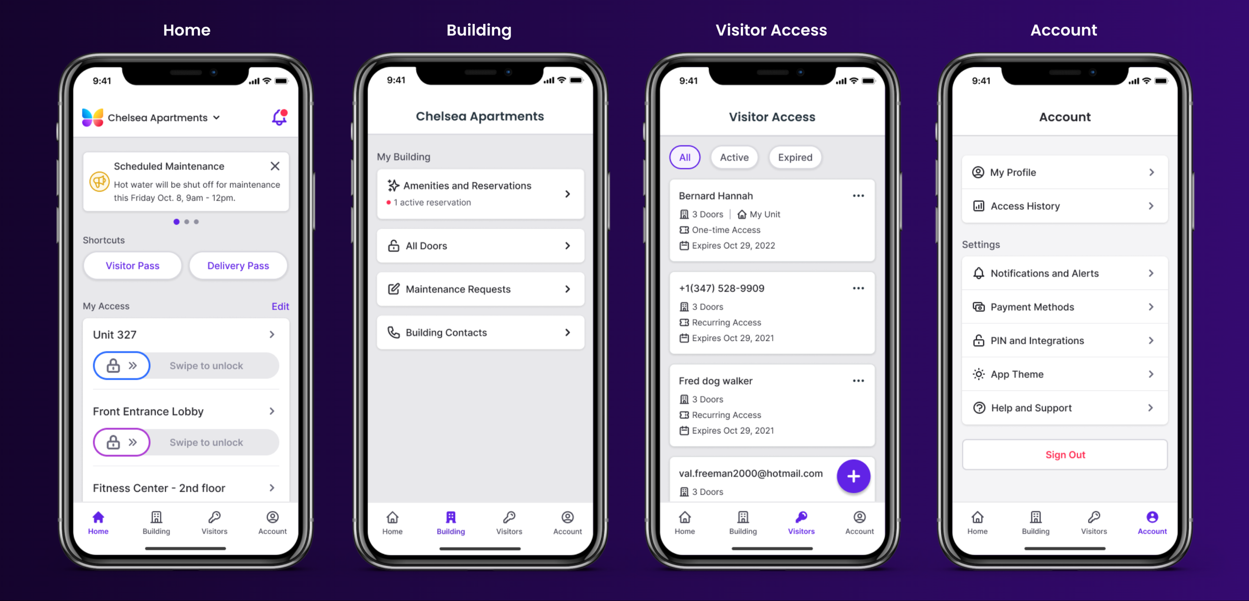
Home
Guest Access
Building Services
Community
Account
Notifications


IA Concept Testing
We used our new IA to design a quick home screen we could use for testing. Using the UserZoom platform we launched an IA usability test to gather feedback on our proposed concept.
10 participants targeting residents in multi-family buildings
Understand their current resident experience and building, including their attitudes about the importance of certain features or services
Identify where the participants would expect to find certain features and content, and if the layout and taxonomy made sense to them.

Testing Feedback
Action Items
Allow more customization and the ability to arrange items on the home screen
Consider quick actions on home screen for other resident needs
Allow flexibility to take action in multiple ways
Make notifications bell more prominent.
Access history can be nested in the account tab (low priority/necessity)
Community features can be nested in the building tab (low priority/necessity)
Attitudes and Preferences
Residents valued having amenities in their building, while community board communications were less important.
Residents were not concerned about having a log of historical guest access but they did care to be notified when a guest arrived/entered.
Residents were most interested in being notified of maintenance in the building and package deliveries.
Residents expected to be able to customize the app and tailor it to their preferences

App UI Exploration and Challenges
We started to make adjustments to the layout and design after receiving user feedback. Unfortunately around this time, we also had a our only mobile developers (2 overseas) leave the company. While this became a set back it allowed us the time to define a new design language for our app and start working on initial screens for our first resident portal feature, amenity reservations.
We then worked with product to sequence the feature work in tandem with the new app UI updates.
Phased Roll-out
Design team to divide and conquer on resident portal features
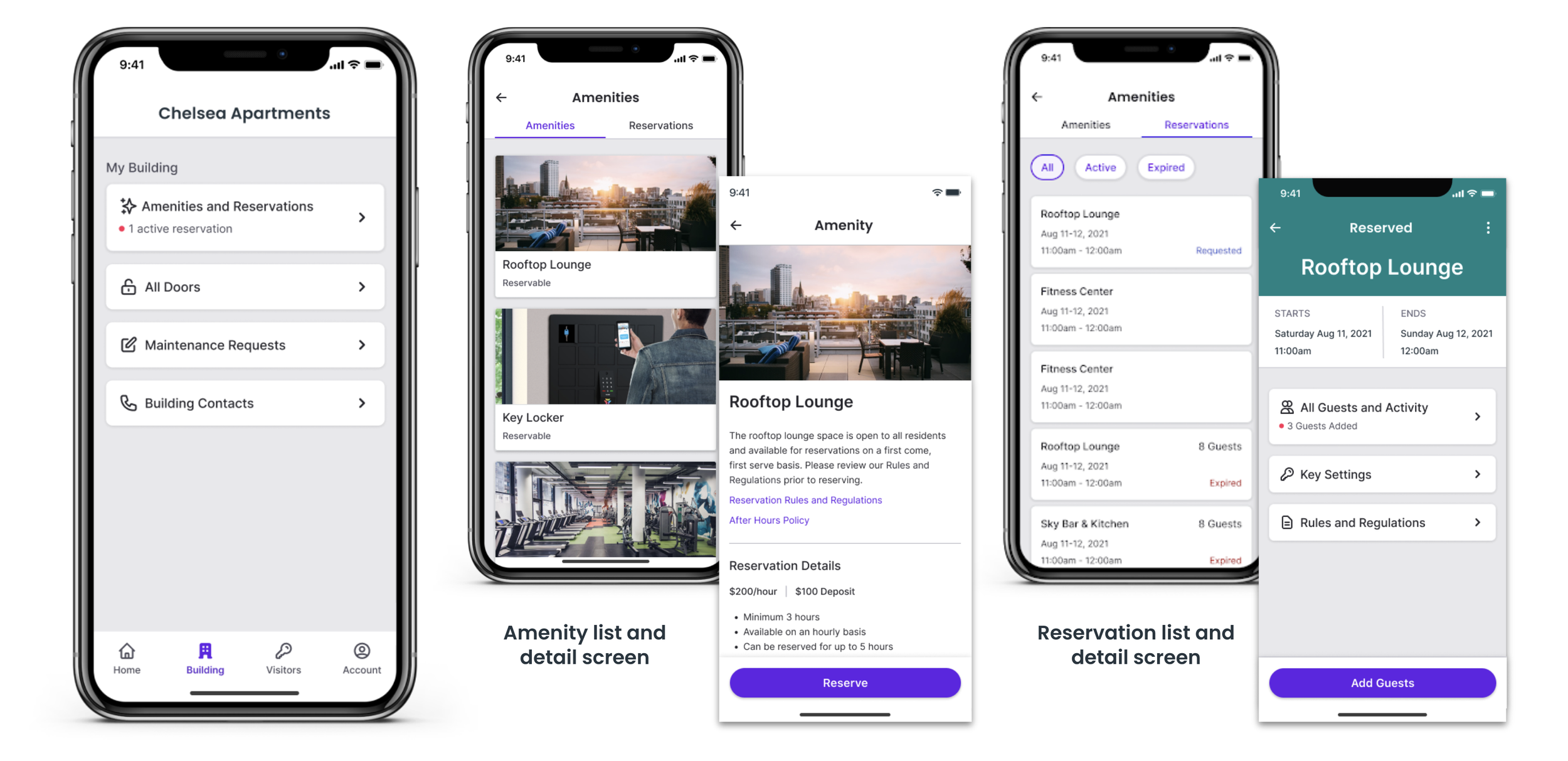
Amenity Reservations
Payments
Maintenance Requests
Create a prioritized resident app checklist of required feature work
Establish mobile style guide
Check accessibility for light and dark modes
Conduct iterative testing and gather feedback


Before and After

New App Screens & Navigation
Amenity Reservations: First New Product to enter the App
Impact & Outcomes
We reviewed our new app experience with the leadership team. Feedback was overwhelmingly positive and there was enthusiasm for the direction from every department lead. We shared a prototype for everyone to test out.
The app went live and currently has a 4.9 rating on the App Store across 100,000+ Ratings
This redesign changed the way the company values user research and testing. It laid the initial groundwork for the future resident feature updates and beyond.
The app continues to scale, allowing the business to partner with smart home and smart lock integration companies, as well as expand into other verticals, technology, and markets.
The app redesign and time afforded allowed us to design a cohesive and consistent system that has been embedded in all of BMX’s products, making it stand out among competitors in both its identity and as an industry leader.