PROJECT OVERVIEW
Building Fun Learning Tools for Children
Kim and I investigated different platforms and UI tech to see what made sense for us to develop. As kids, our museum visits were somewhat boring but we loved seeing the art and history it had to offer. We saw a potential opportunity to improve "The Met Experience" for kids.
Challenge
We had to be practical about what we were building and make sure that it was applicable to the setting, user, and circumstances. We set out to create a more engaging experience as an iOS App.
RESEARCH & ANALYSIS
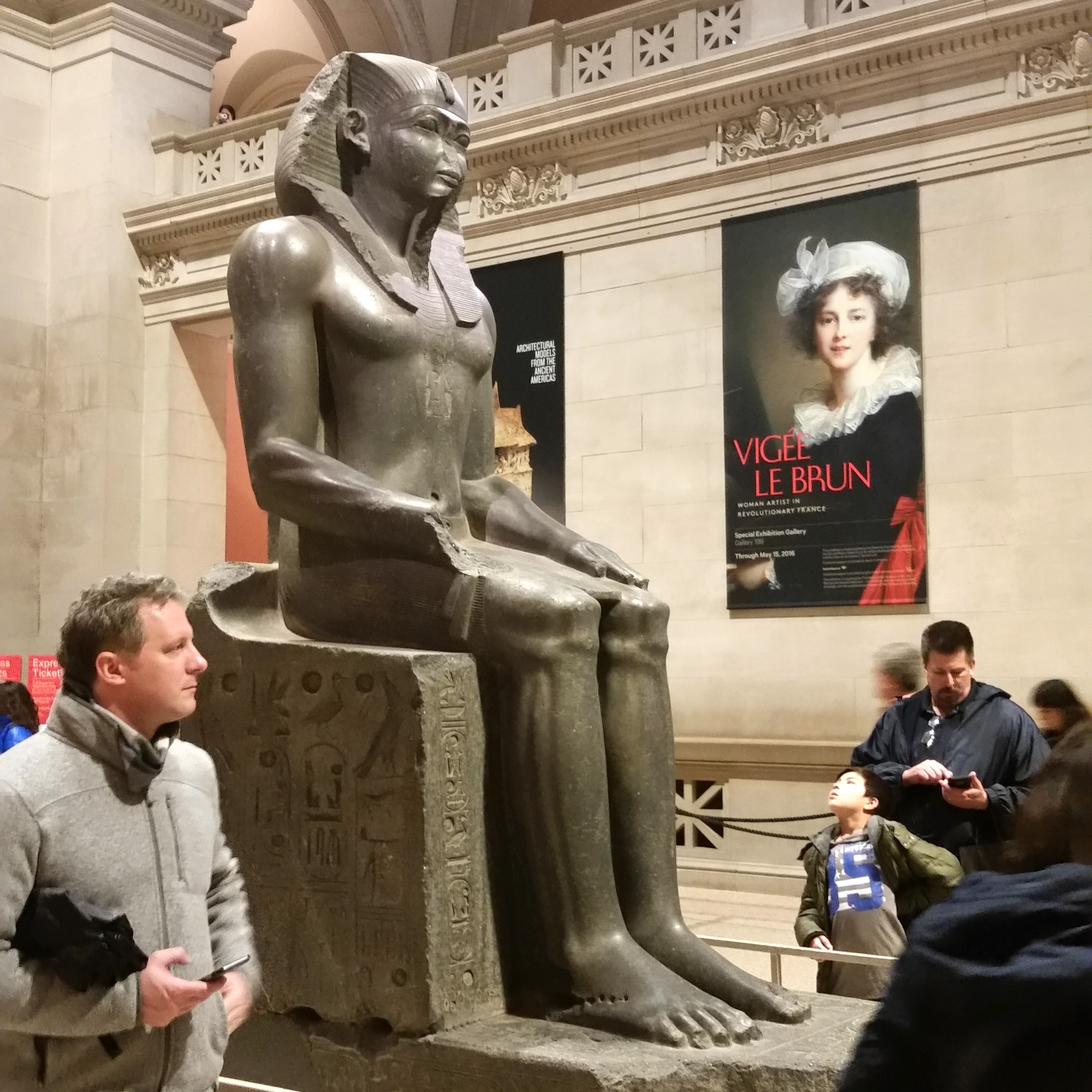
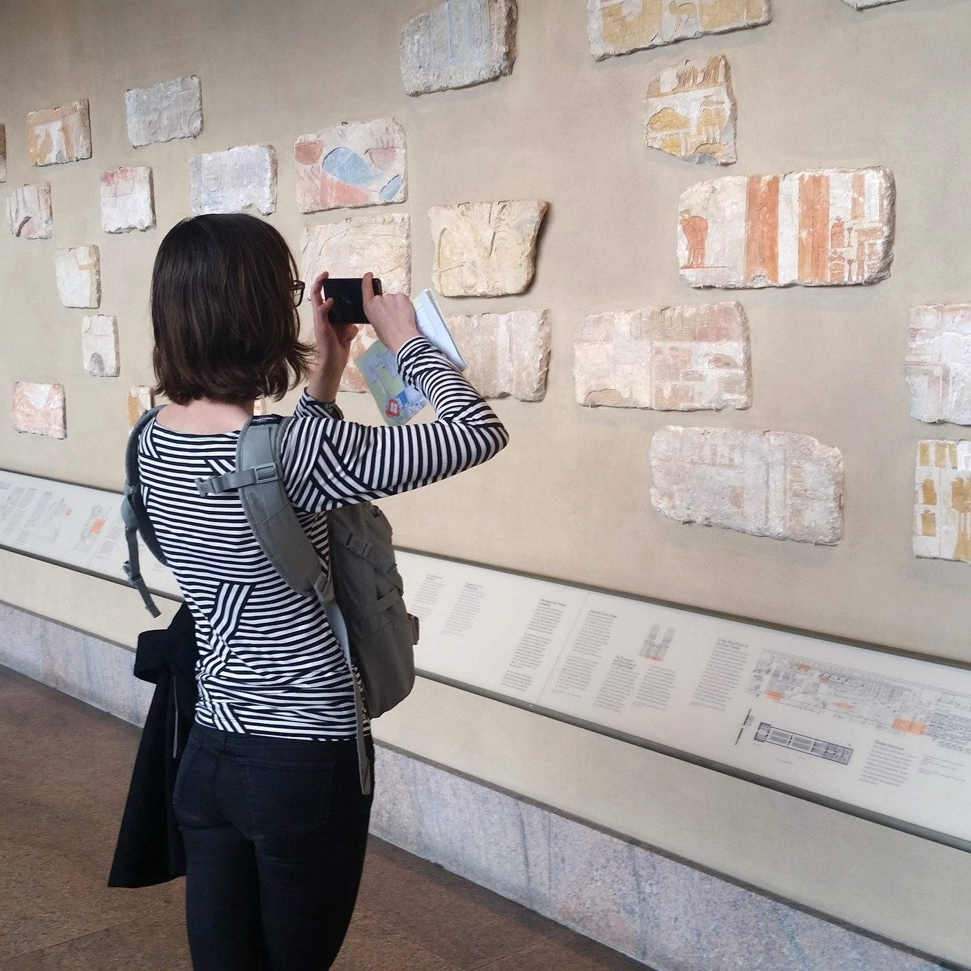
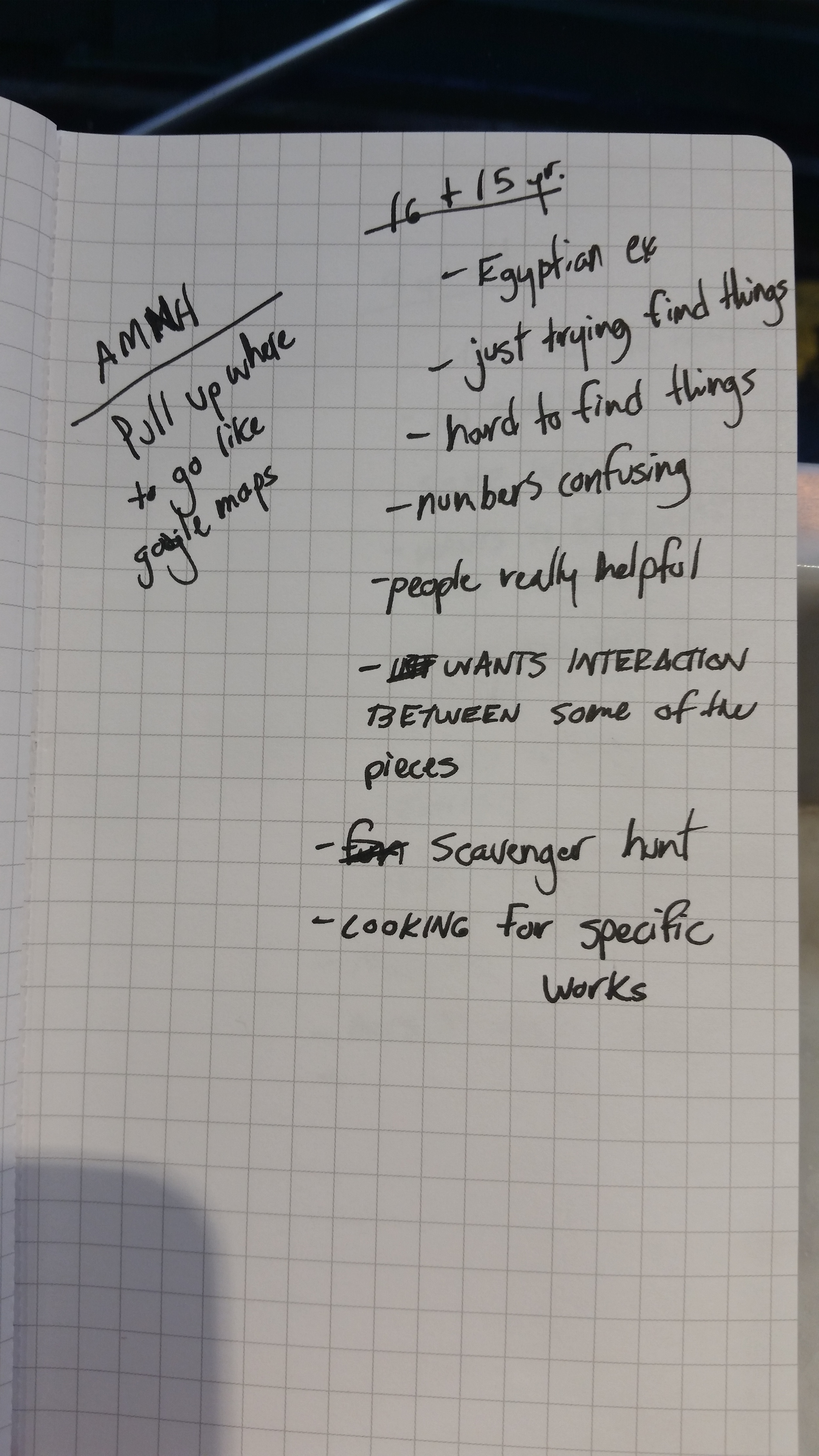
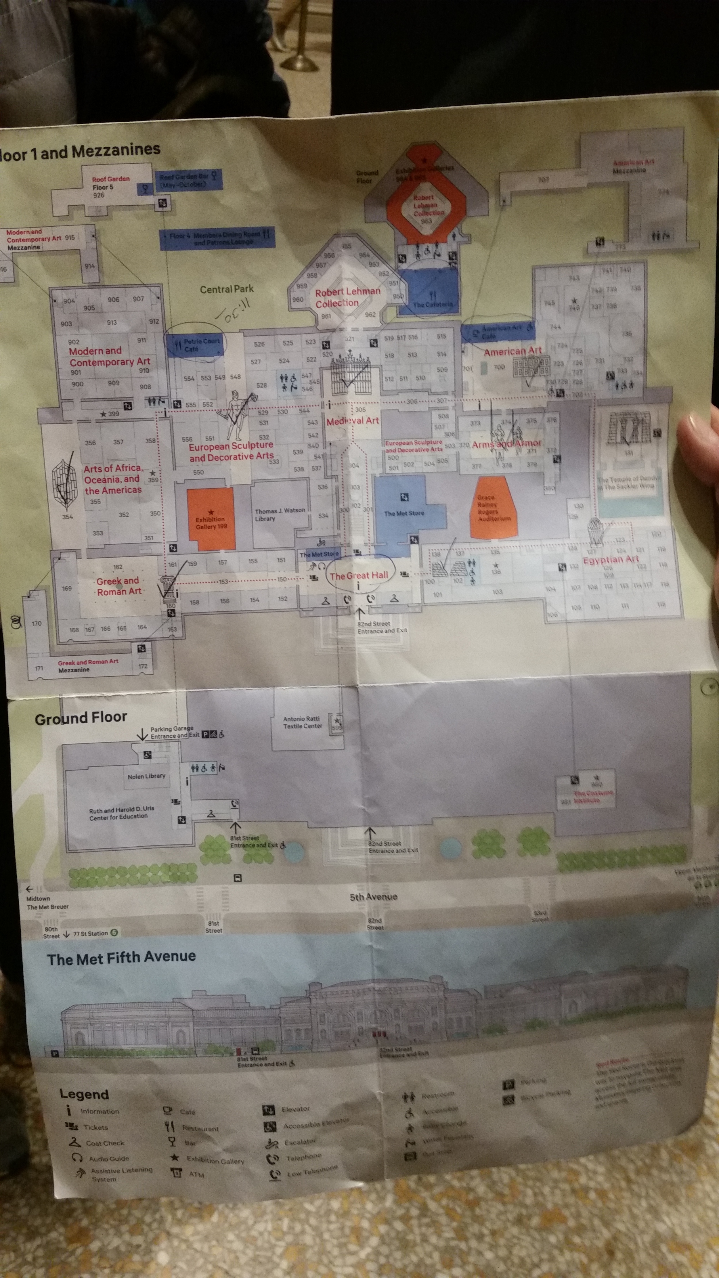
We conducted a contextual inquiry at the museum to observe how visitors were currently experiencing the museum. We arrived at the end of the day which made it easier for us to interview families and groups on their way out of the museum.
"The amount of art is overwhelming."
10 year old girl created her own scavenger hunt game on the map.
This confirmed our initial hypothesis and gave us a model for our design focus.
interviewed 10 kids (ages 6-15) accompanied by their parent(s).
the majority noted the museum was overwhelming and difficult to locate certain items.
KEY TAKEAWAYS
Mobile Devices
The majority we observed carried a mobile device. In addition the audio tours (although slow and not fun) used iPod devices.
Navigation Issues
Many had difficulty locating certain pieces of art and found the museum overwhelming. All kids were accompanied by an adult.
Disengagement
Kids want to learn about the art and want more interaction with the museum.
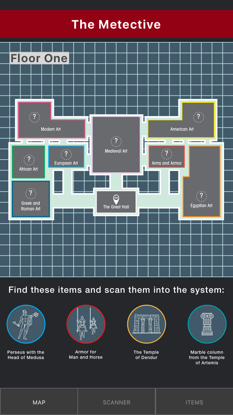
SOLUTION: The Metective App
The Value Proposition
- Engaging Interactive experiences that are useful learning tools for kids.
- Reducing boredom by providing a fun way for kids to explore the museum.
- Providing Parents/Teachers with a way to get their kids to enjoy the museum.
- A fun way for users to easily navigate the museum.
- Giving users access to the art and information of their visit at any given time.
- The museum benefits by increased user base and participation.
- An increase in return visitors. (satisfaction and loyalty)
PERSONAS & USER FLOWS
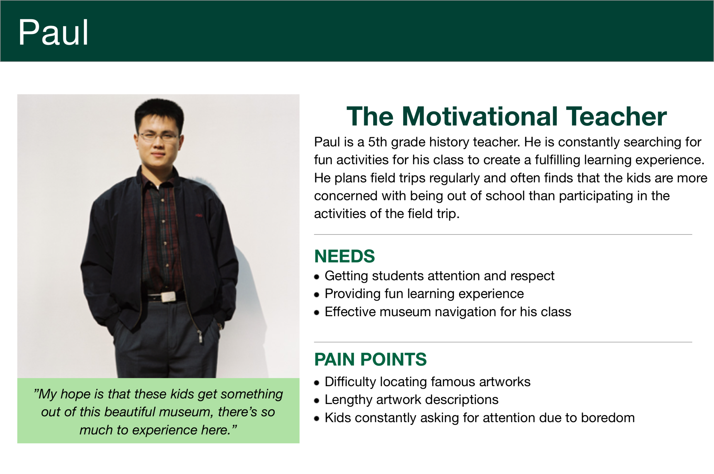
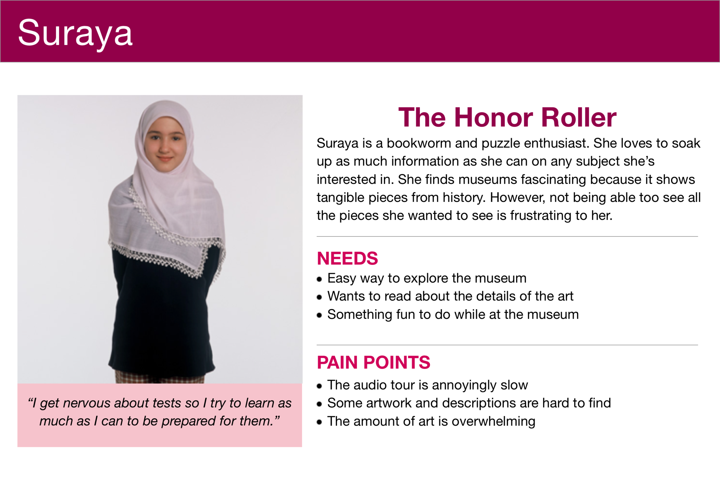
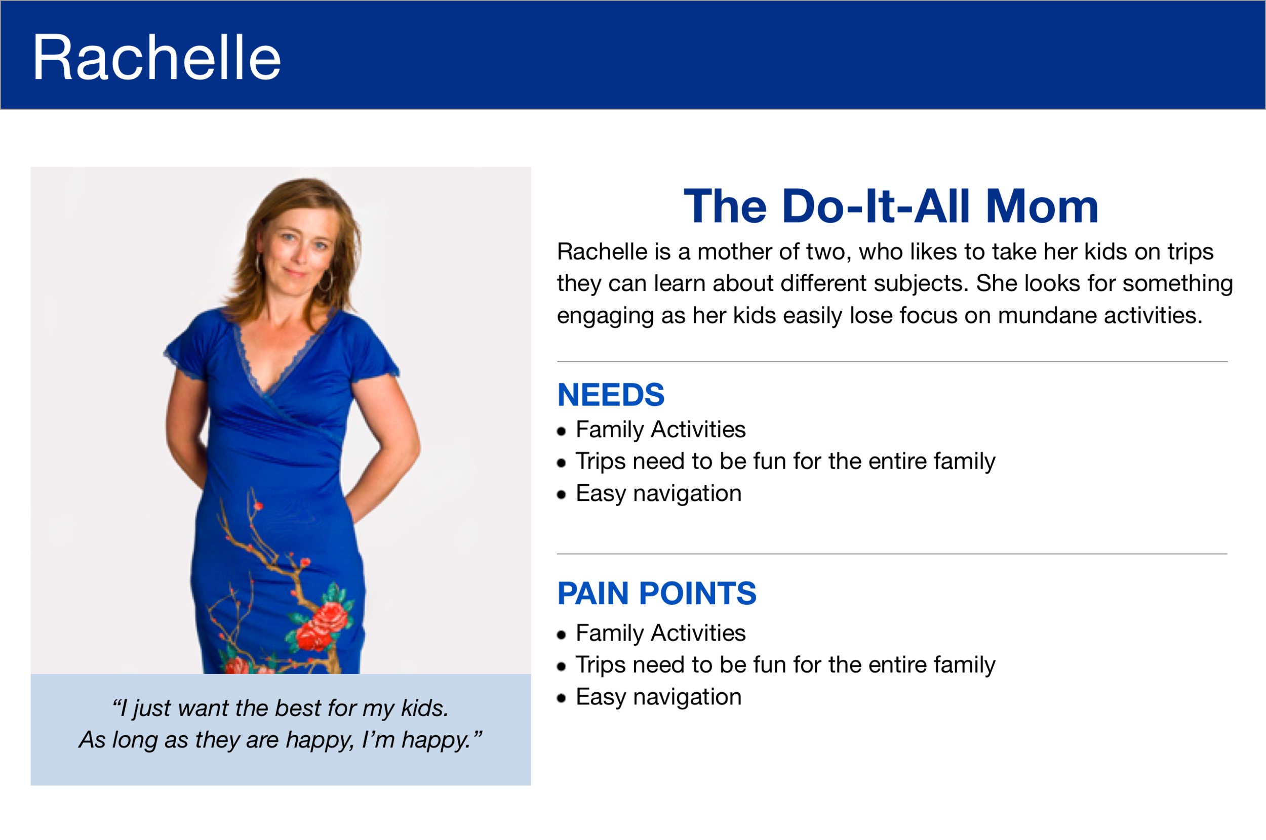
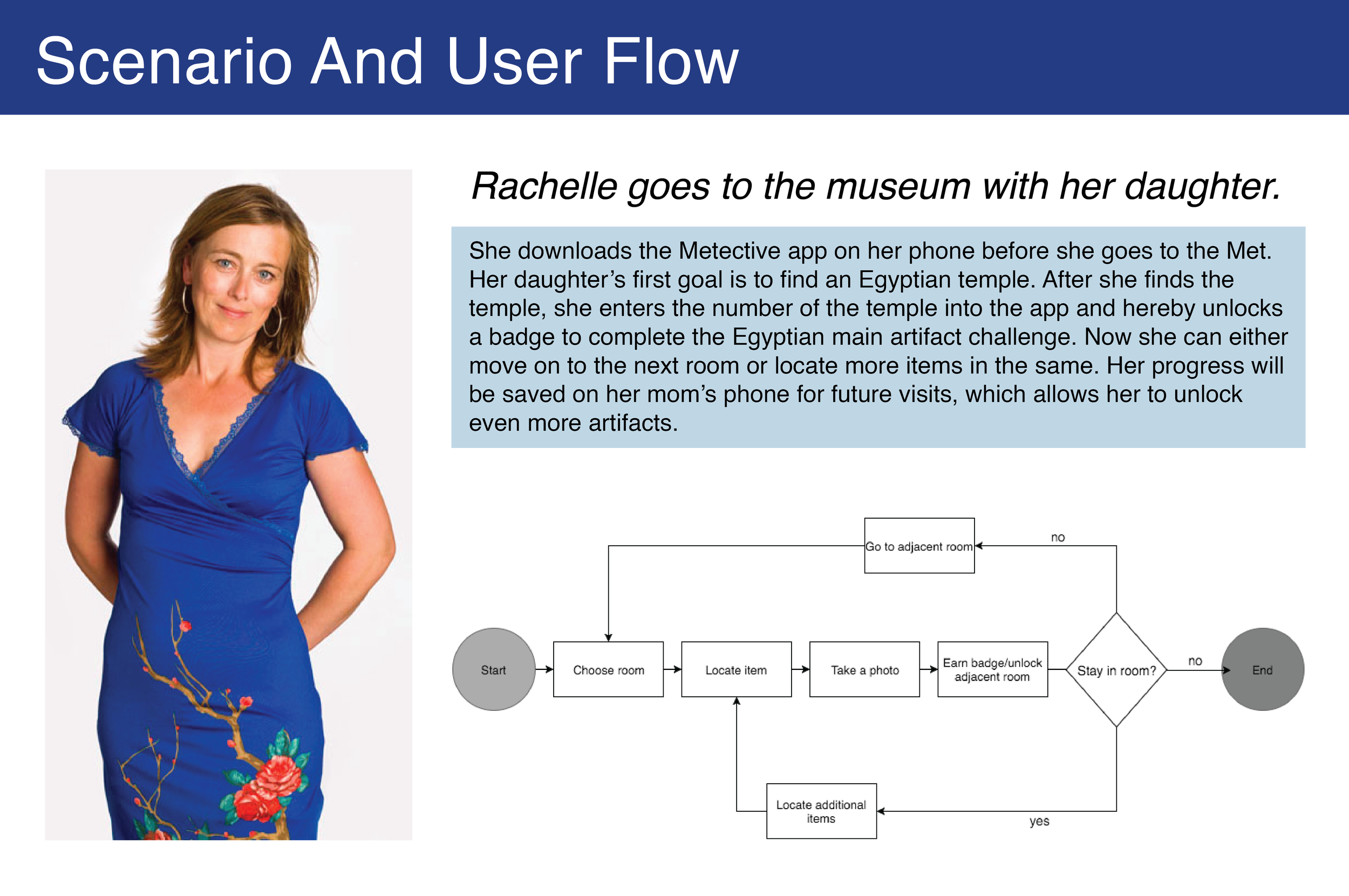
From our research we developed 3 personas of museumgoers based on their needs and behaviors and organized a flow of how they would use the app.
Teacher
Student
Mother
We focused our attention on the Mother who benefited the most from our solution. We then created a scenario in which she would use the app. Our primary flow shows how it works with the museum visit.
SKETCHES AND GAME DESIGN
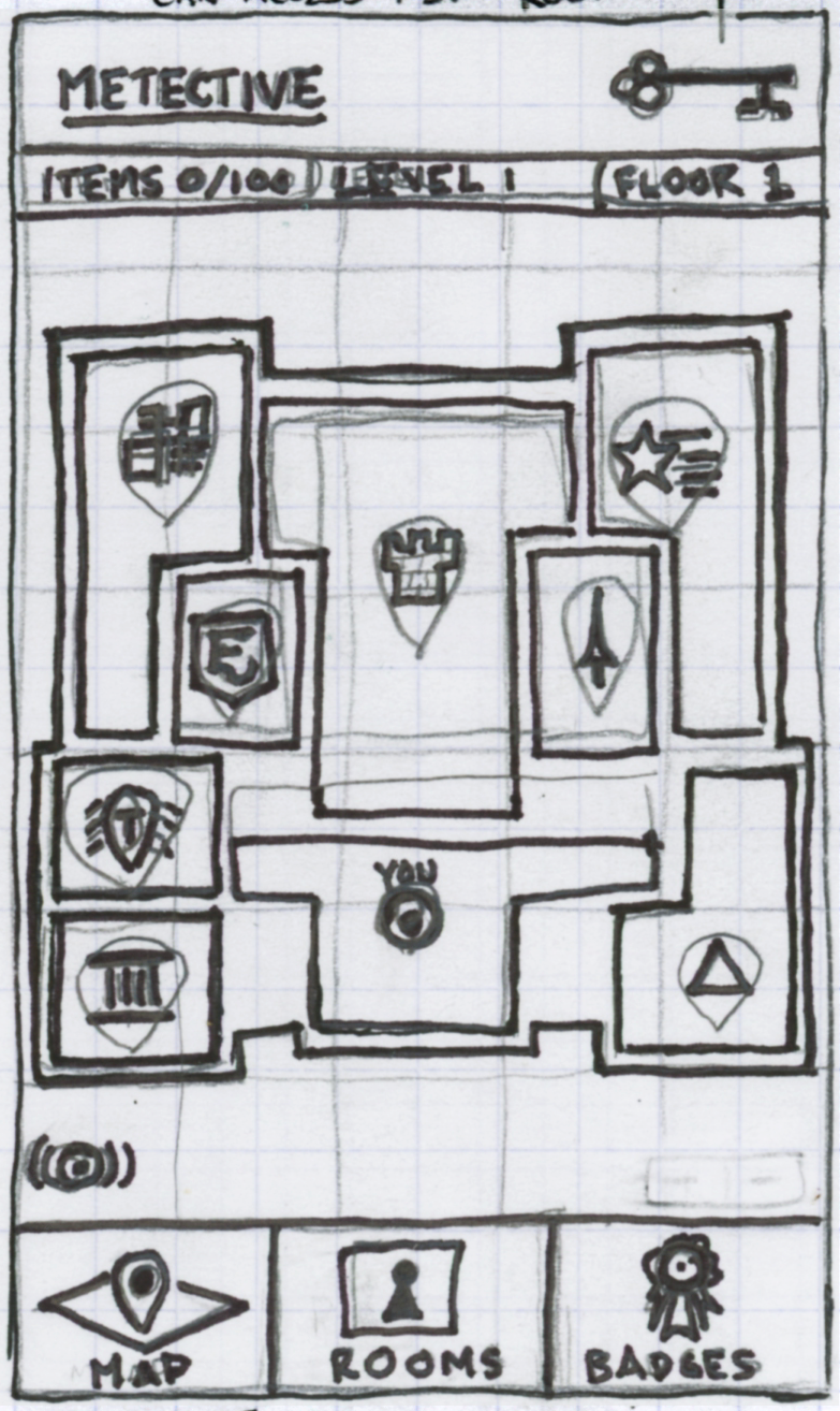
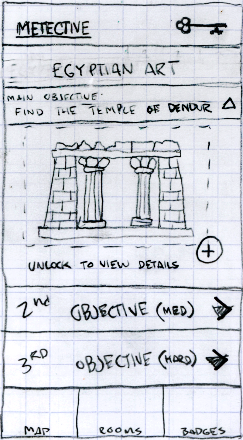
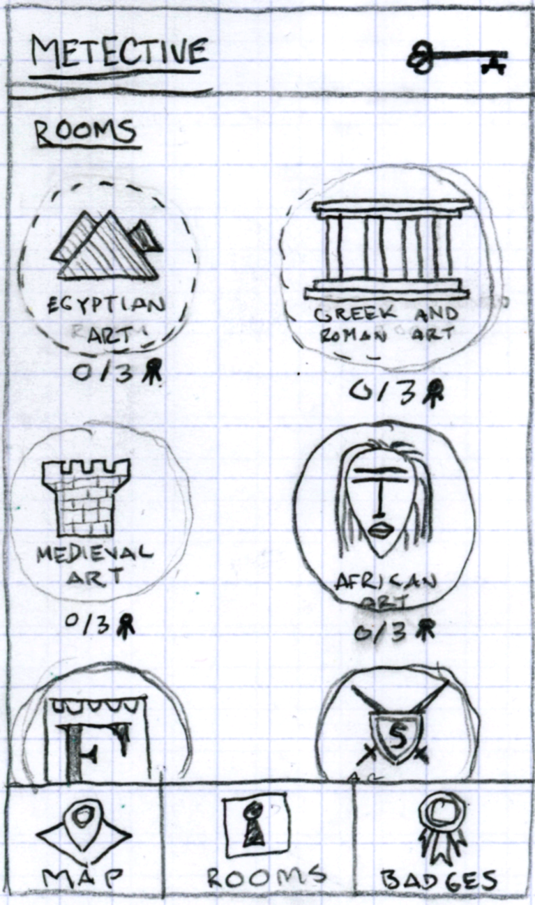
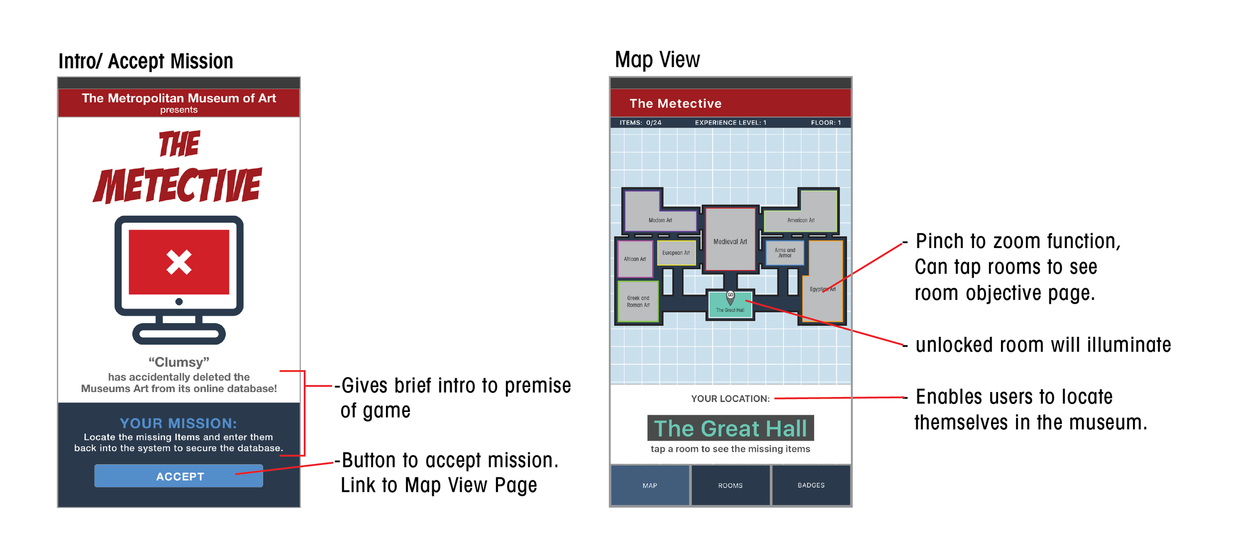
We started with sketches of initial ideas and used the museum map as a jumping off point. We used our primary flow to design our mvp, creating screens that reflected the navigation and actions of the user. We also needed to create meaning in the game to engage and motivate the user.
Context
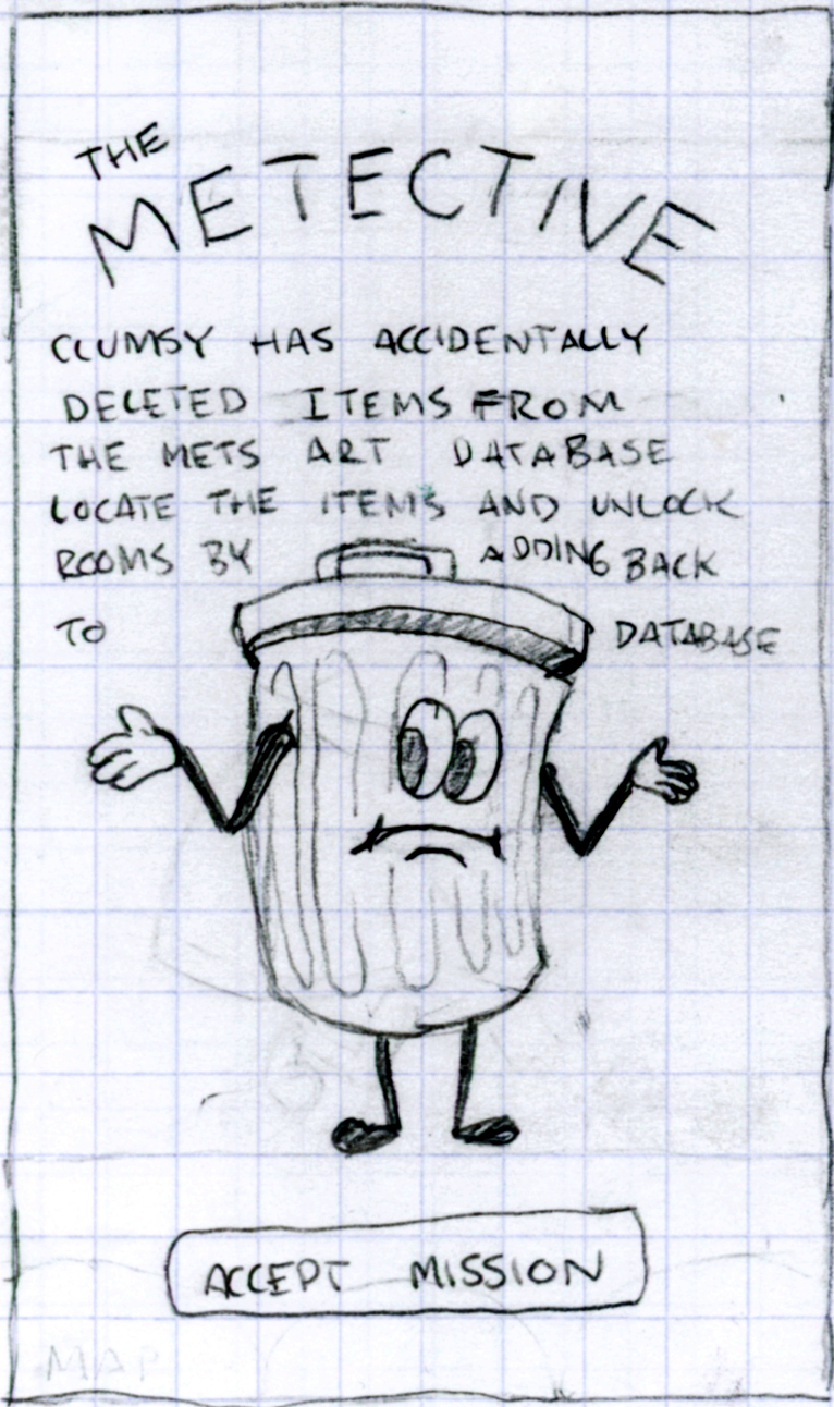
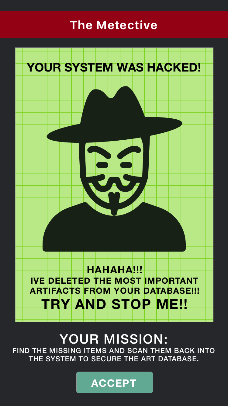
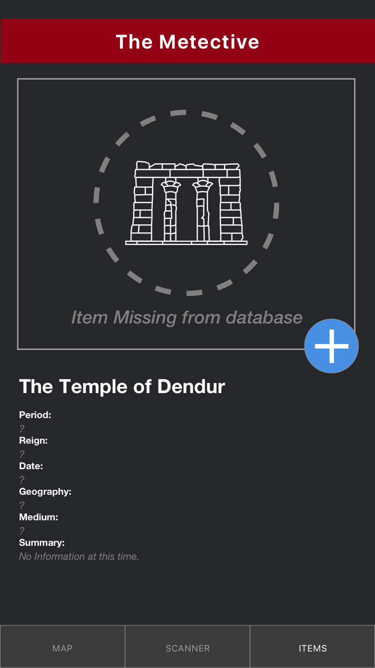
We needed to give the user a reason to play the game. We developed a storyline based on a character named "Clumsy" who accidentally broke the online database. Users are tasked with locating the missing art and entering it back into the system to unlock the information about the art.
Difficulty Levels
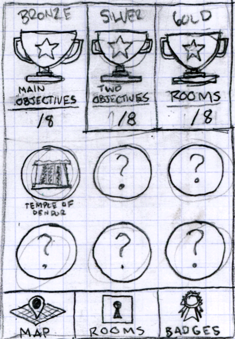
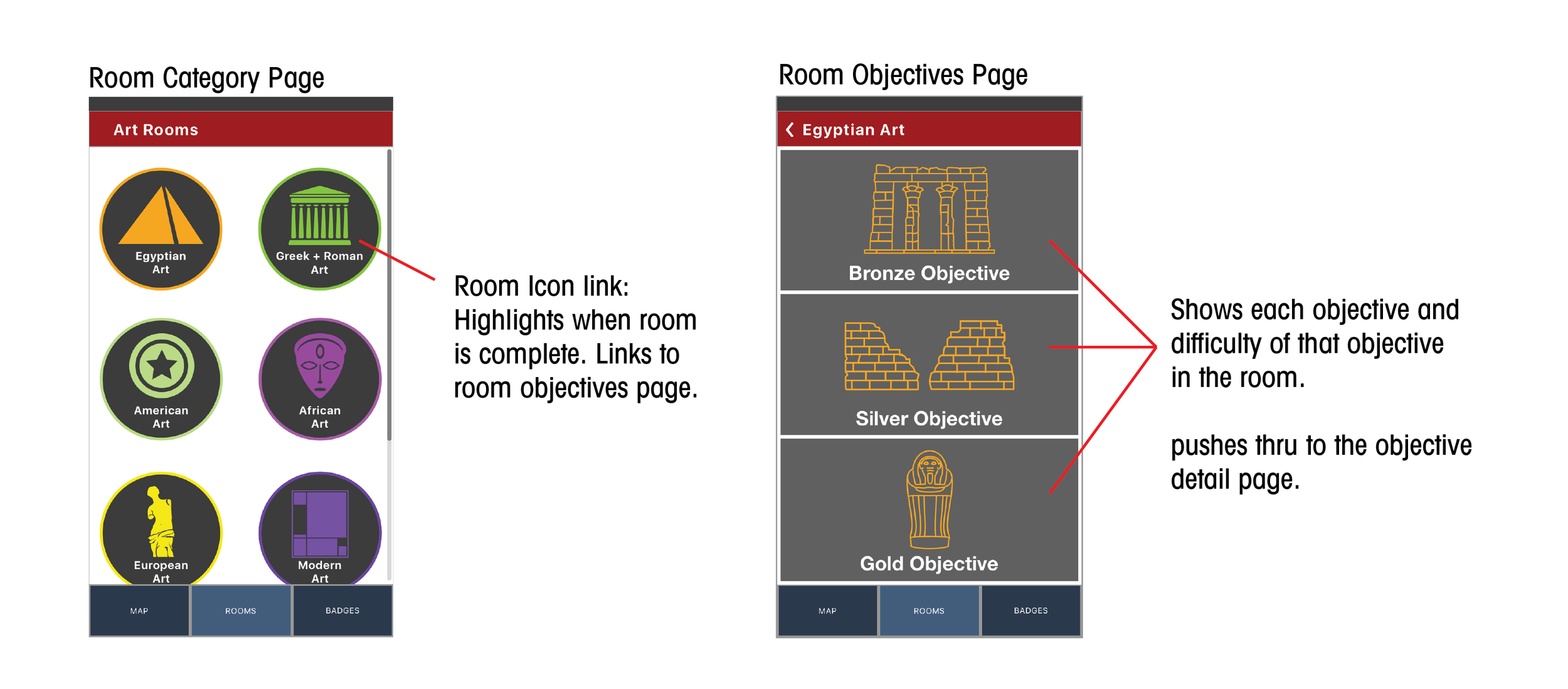
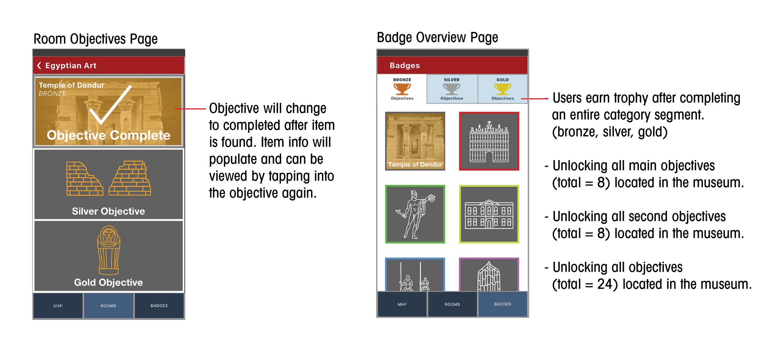
We differentiated the objectives in the game by making items easier or harder to find (bronze, silver, gold). This would allow users to unlock trophies and badges for reaching milestones in the game. The trophies and badges reflect the progress the user has made so that they are aware of their status in the game.
Reward Based Interaction
We had to let the users know whenever they did something in the game. The users would receive feedback through messaging, screen overlays, or updates to the UI(visual components) that would indicate errors or success.
TESTING AND ITERATIONS
Testing in Union Square Park
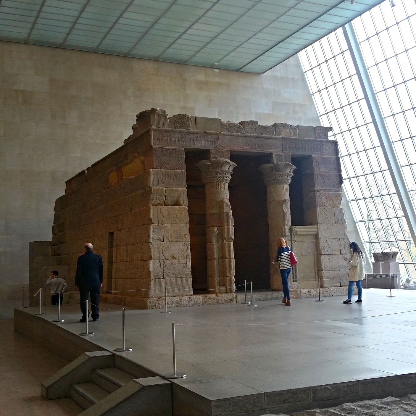
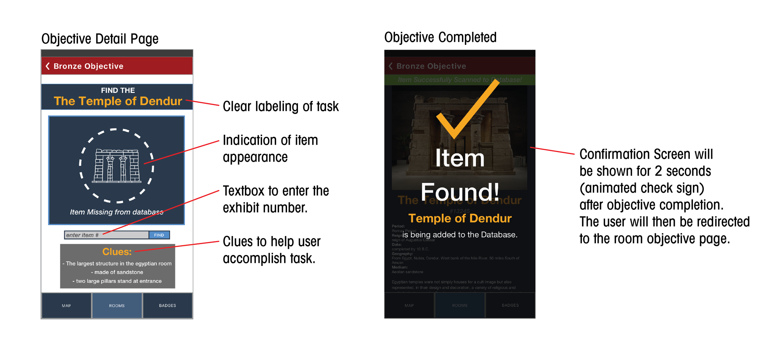
We managed to find 4 users (children with parents) to test our prototype. We setup 3 pictures on a bench of large icons from the museum. The task was to locate the Temple of Dendur and to snap a picture of the object when it was found. The system would confirm the photo and populate the information and picture of the temple.
FYI: Your not allowed on the Playground without a kid.
Test Findings
- The interface was too dark and not friendly
- The character of the story is too scary
- Kids really liked the concept
- Reward system was unclear
TECH CONSTRAINTS
After speaking with developers, we realized that a build of this capacity for a CMS would be expensive, and photo recognition would be difficult. We opted to simplify our mvp by having users enter an exhibit number they could locate near each item to match to their objective. This only involved cataloging the information that was already present, reducing the need for a hefty CMS.
WIREFRAMES AND ANNOTATIONS
FINAL THOUGHTS
Creating Value for the Customers and Business
Our goal was to make a product that could serve the need for higher engagement in a traditional museum setting. We wanted to leverage technology to create these opportunities and deliver a product that serves both user and business needs. Seeing as the museum relies on the attendance of visitors, the end goal of providing a pleasant museum experience results in satisfied customers who either become return visitors or relay their experience to other potential museumgoers.
Areas of Opportunity
- More user testing in a controlled setting
- Offer App in different languages
- Include all floors of museum and expand items
- Have redeemable physical items for achievements
- Create custom photo gallery
- More milestones and badges


