Redesigning the dashboard for SMBs and Enterprise clients
PROJECT OVERVIEW
Web.com’s lead generation dashboard helps businesses attract new customers, manage existing ones, and understand performance. I was responsible for redesigning the IA and reporting pages for both enterprise and local business owner dashboards.
PURPOSE
Our goal was to increase user engagement, overall satisfaction and reduce client churn. We noticed that over 70% of new users stopped engaging with the dashboard within the first 90 days, and around 50% of those users would churn in 3-5 months. We hypothesized that if we could improve the dashboard by addressing user needs, functionality, and architecture, we would see an uptick in adoption of the dashboard and higher retention with the product.
User Research
In order to get started I wanted to learn how our clients were using the product, what their business needs were and any pain points. I worked closely with Customer Service to gain perspective on how clients felt about the dashboard and sourced a list of clients I could contact to interview.
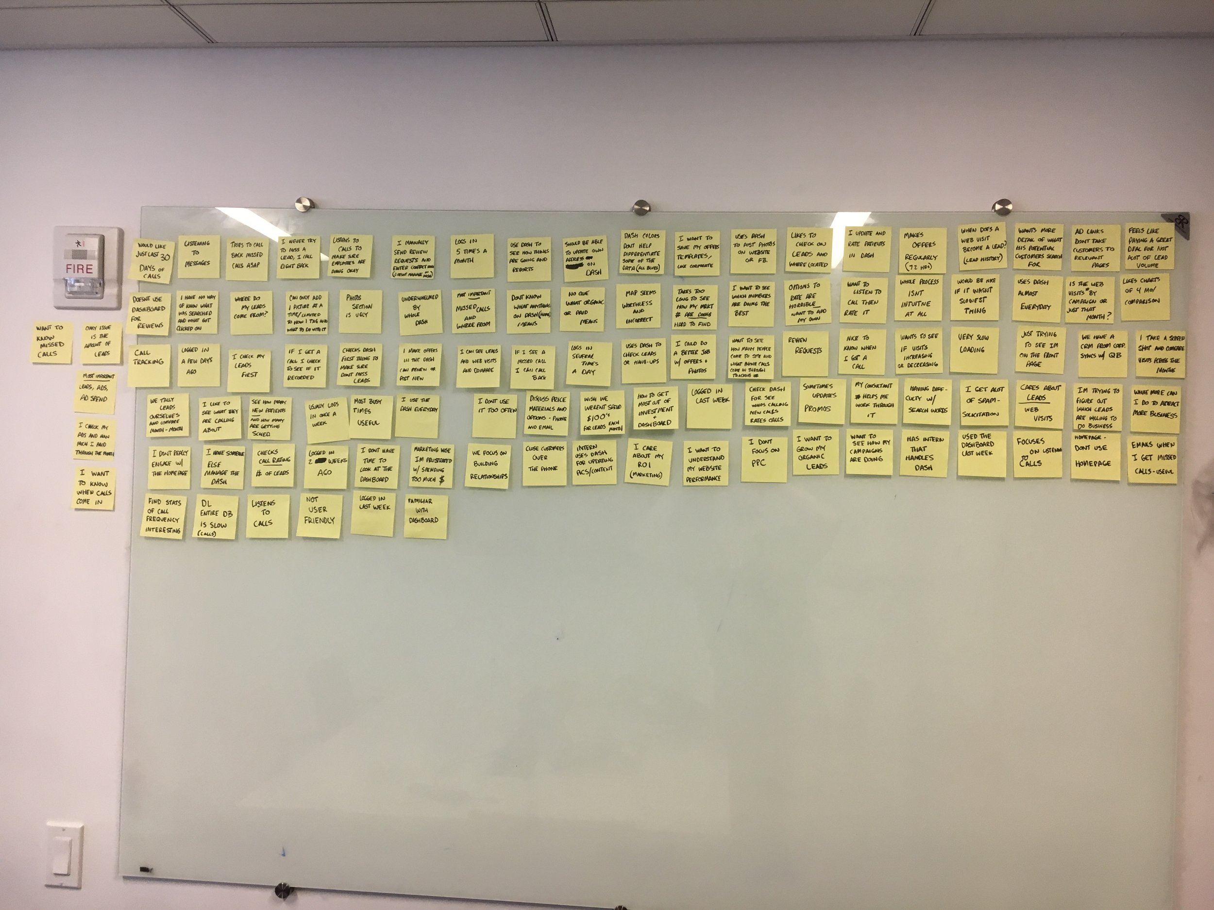
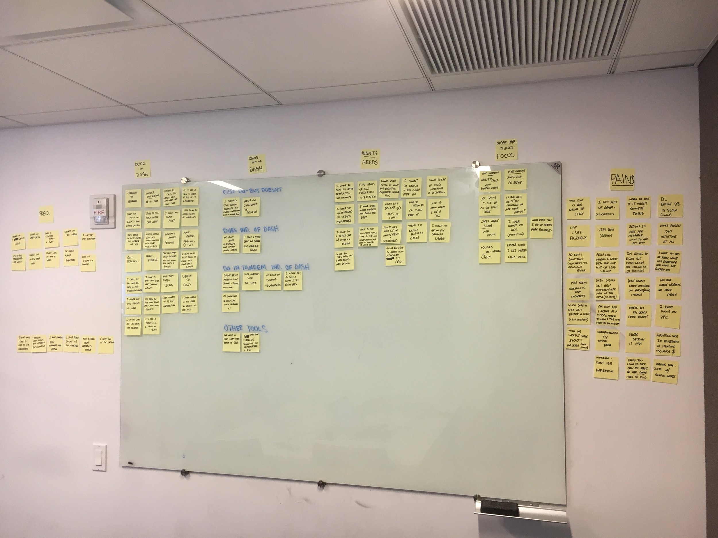
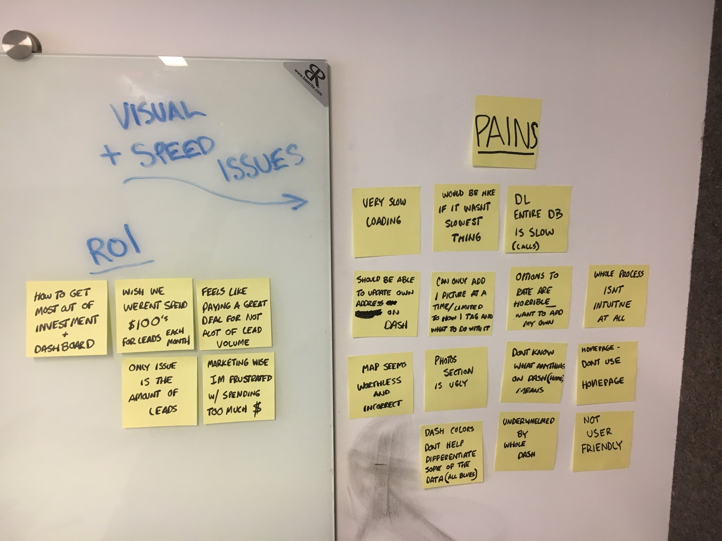
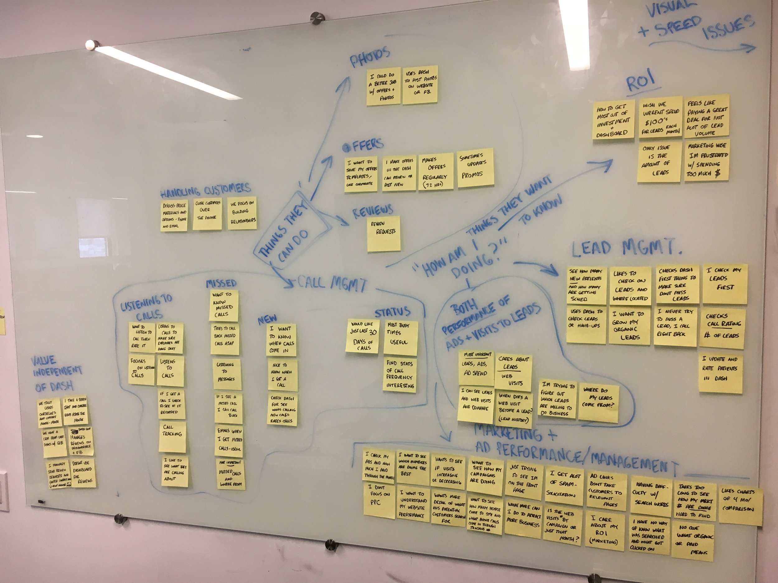
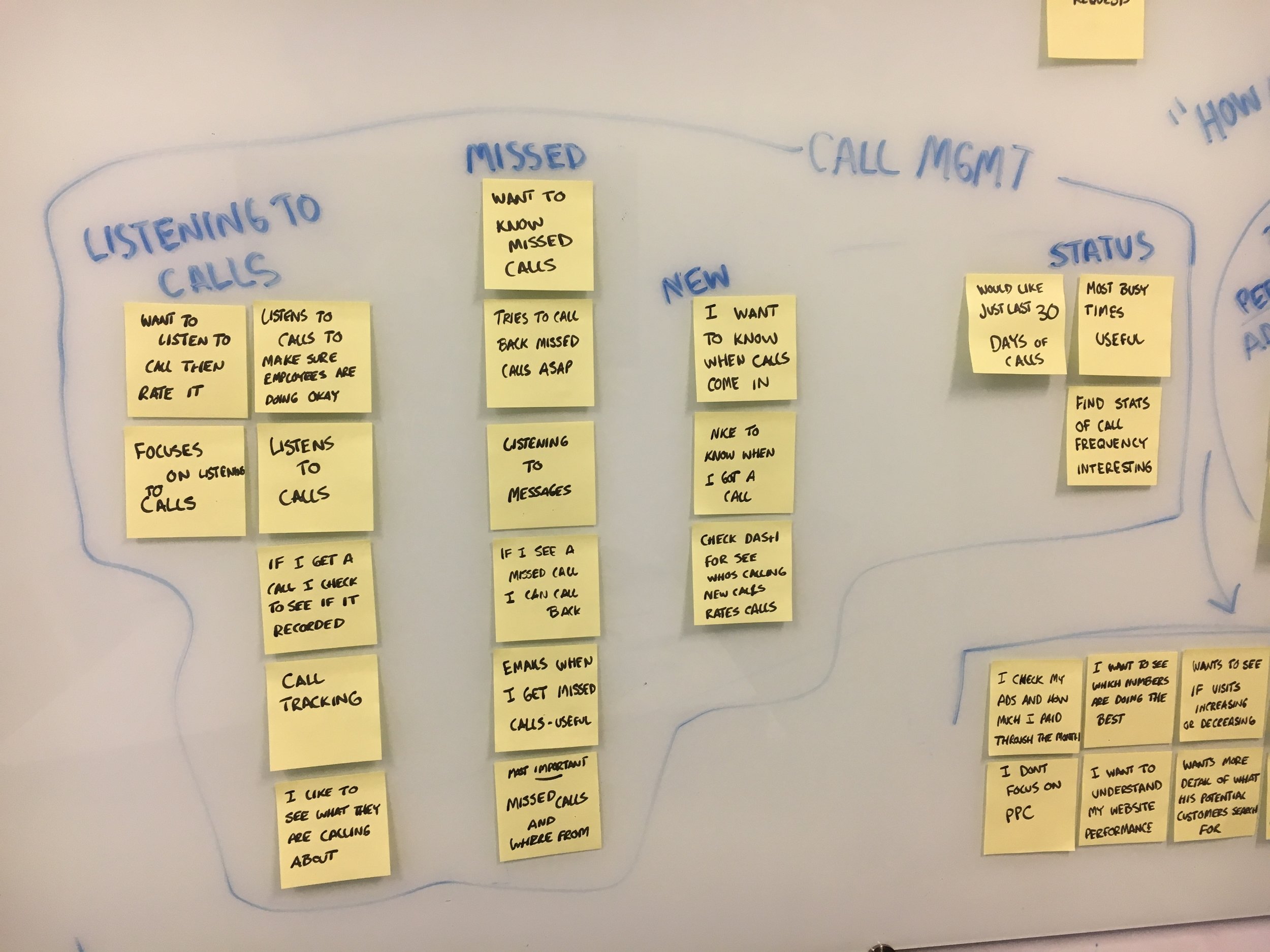
AFFINITY MAPPING
I recorded all feedback on post-it notes and ran a mapping exercise to discover common themes and sentiments. I noticed the biggest concern for clients was trying to determine “How am I doing?” Essentially, clients are having a difficult time understanding ROI as it relates to ad performance and leads they have received.
USER INTERVIEWS
I gathered clients to cold call and broke them down into different engagement clusters (high/med/low). I then drafted questions for each cluster to understand what value highly engaged users were getting and why low or non-engaged users weren’t using the product. Out of 60, I managed to get interviews with 10 clients.
KEY TAKEAWAYS
The Experience is Not Intuitive or Efficient
“Something that should take me 10 minutes to do, takes me 30 minutes...”
I Have Trouble Understanding Performance
“I want to know which campaigns are doing the best.”
It’s Difficult Knowing What I Can Do
“The question is what more can I do to attract the type of business that I’m looking for?”
Competitive Analysis
I wanted to see how other dashboards were designed and gather inspiration on how best to serve up information. I looked at several and noticed they all served as a snapshot of overall status. Like a launch pad, most dashboards give a high level view of key insights. The best ones were simple, clear, and prioritized the most important information at the top, to then more granular and less immediate towards the bottom.
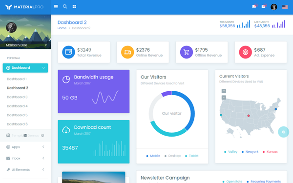
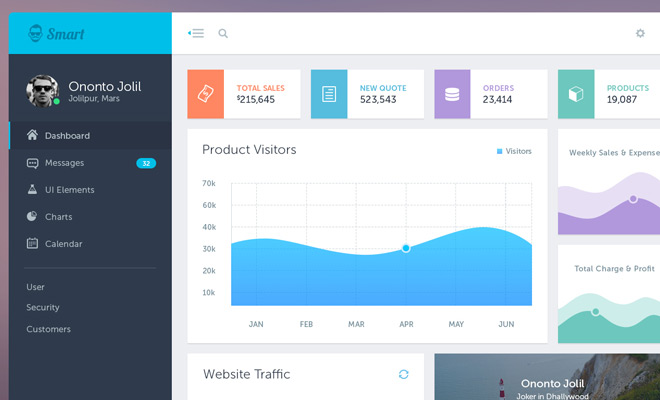
Best Practices
Reduce cognitive load, less is more
Prioritize the most important information at the top
Provide actionable insights that can help users find more detailed information
Holistic status at a glance
Initial Sketches and Ideation
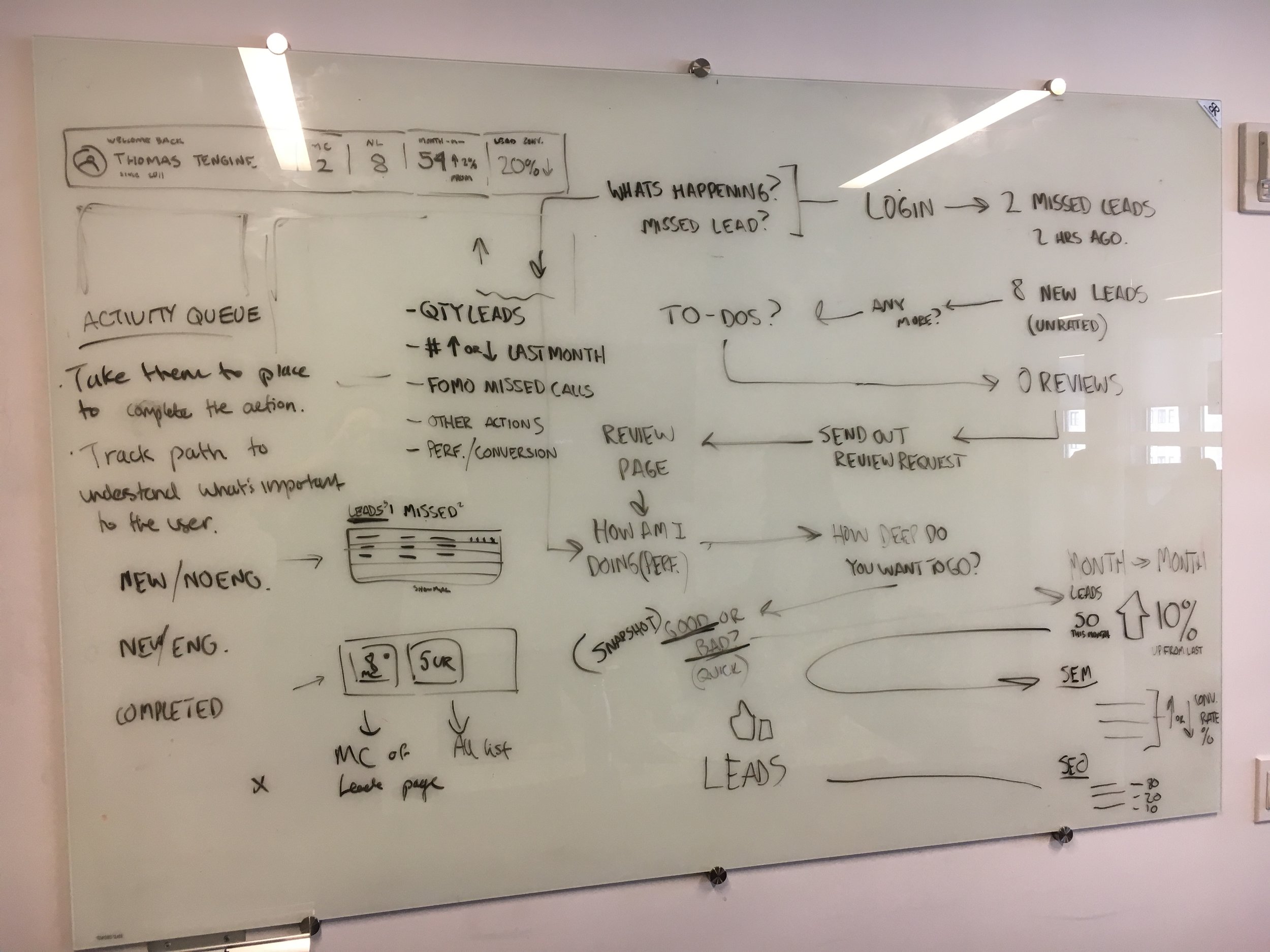
I held whiteboarding sessions to get other perspectives involved from both engineering and product. To say the least there were lots of ideas that needed validating. To help focus on the goal I came up with some user perspective questions, based on the voice of customer priorities and conversations with clients, to drive inspiration in the design process.
User perspective questions: (Motivations)
Do I have any missed calls I need to know about?
How many leads have I gotten since my last visit?
How many leads have been generated in my billing cycle?
What did they cost me?
How am I “doing” compared to last month?
Which of my ad campaigns are performing the best?
How is my SEO ranking? (Top performing search terms)
What actions can I take to improve my online presence/reputation?
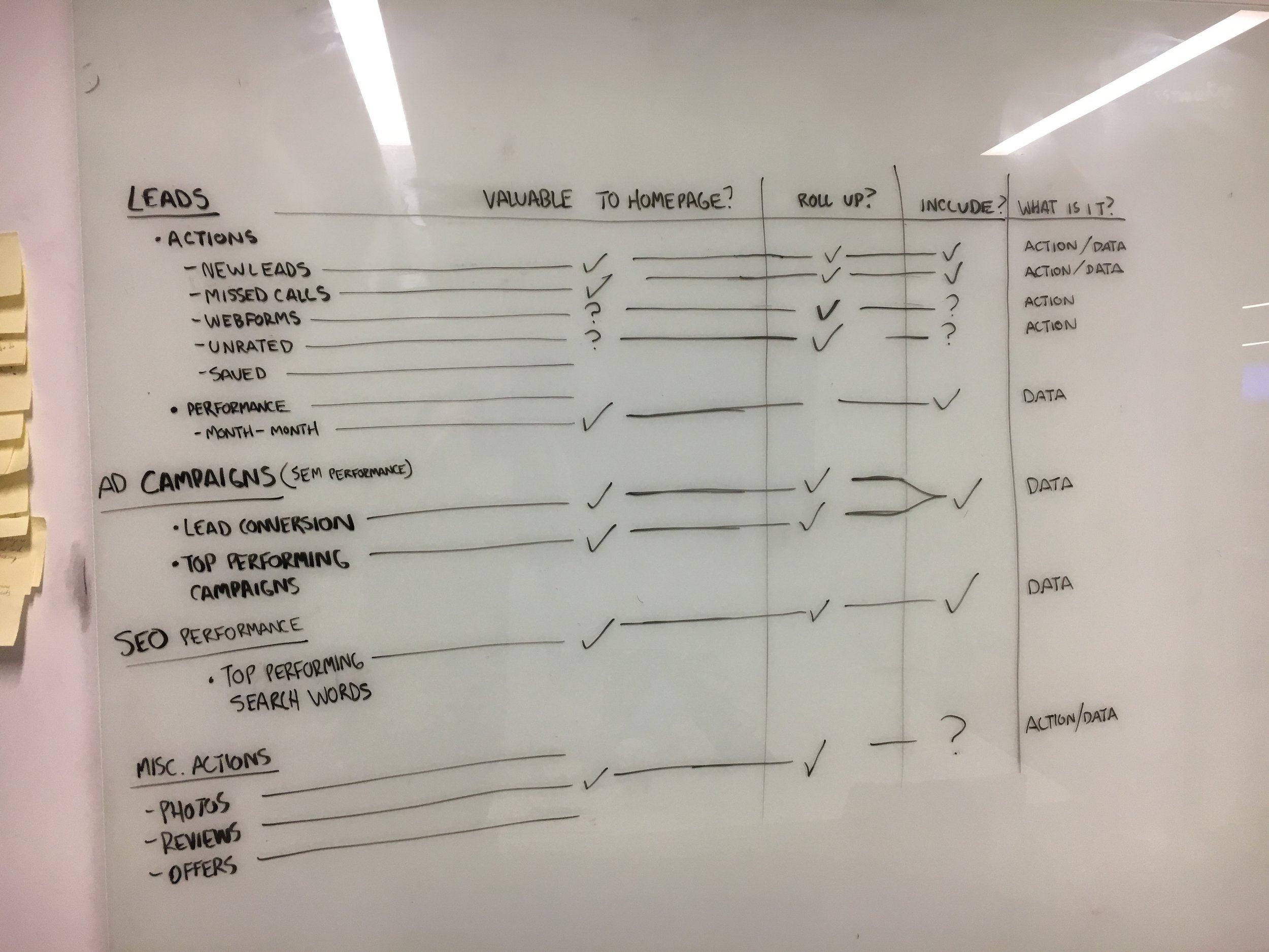
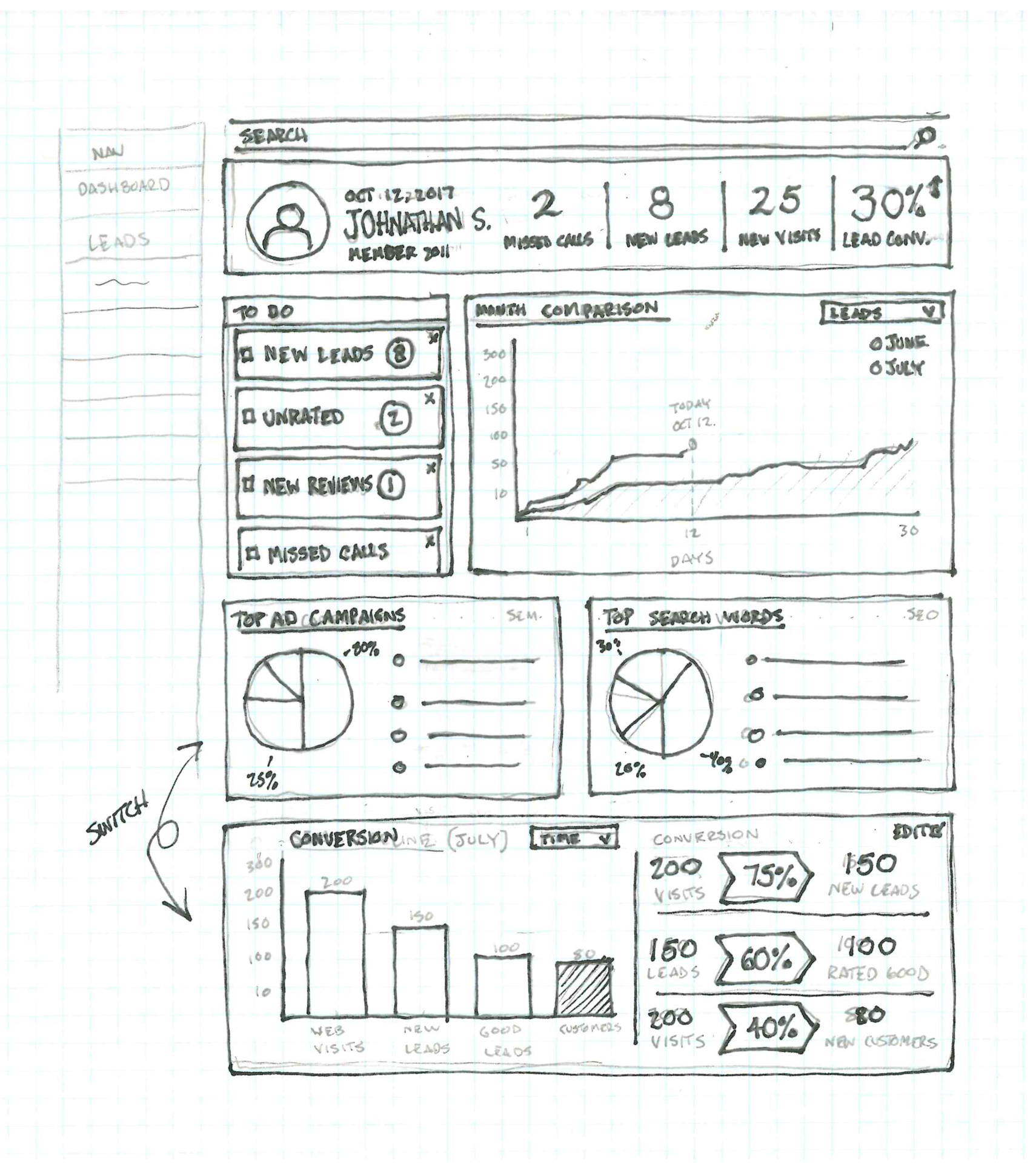
ITERATIONS AND FEEDBACK
My goal was to communicate a overall account health by providing a snapshot of Lead performance. I presented concepts in design reviews with the LBOE Teams (Design/Prod/Eng). The biggest questions were around what was most important to show and technical challenges when pushing users to other parts of the experience.
USER TESTING
After bargaining for time, I only had a few days to conduct user testing. I wanted to validate our best concept and gain actionable insights to move forward in the design process. In similar fashion I planned to cold call clients because of the success I had during user research and the short timeframe. I shared the homepage design while on the call and gathered first impressions. I then Asked specific questions about each component to validate that they were clear and understood as intended, and also to determine what the client would do with this information.
OUTCOME
“This is everything that I want to know when I am logging in. It’s easy to understand, easy to look at quickly to reference and it shows what I care about. Its pertinent information as far as tracking is concerned.”
While I wish were able to gather more participants. We verified that the components were clear, intuitive, and useful. All 3 participants successfully understood what the components were telling them and also commented on the improvement compared to their current dashboard. One asked when they would see these changes go live so that they could start using them.
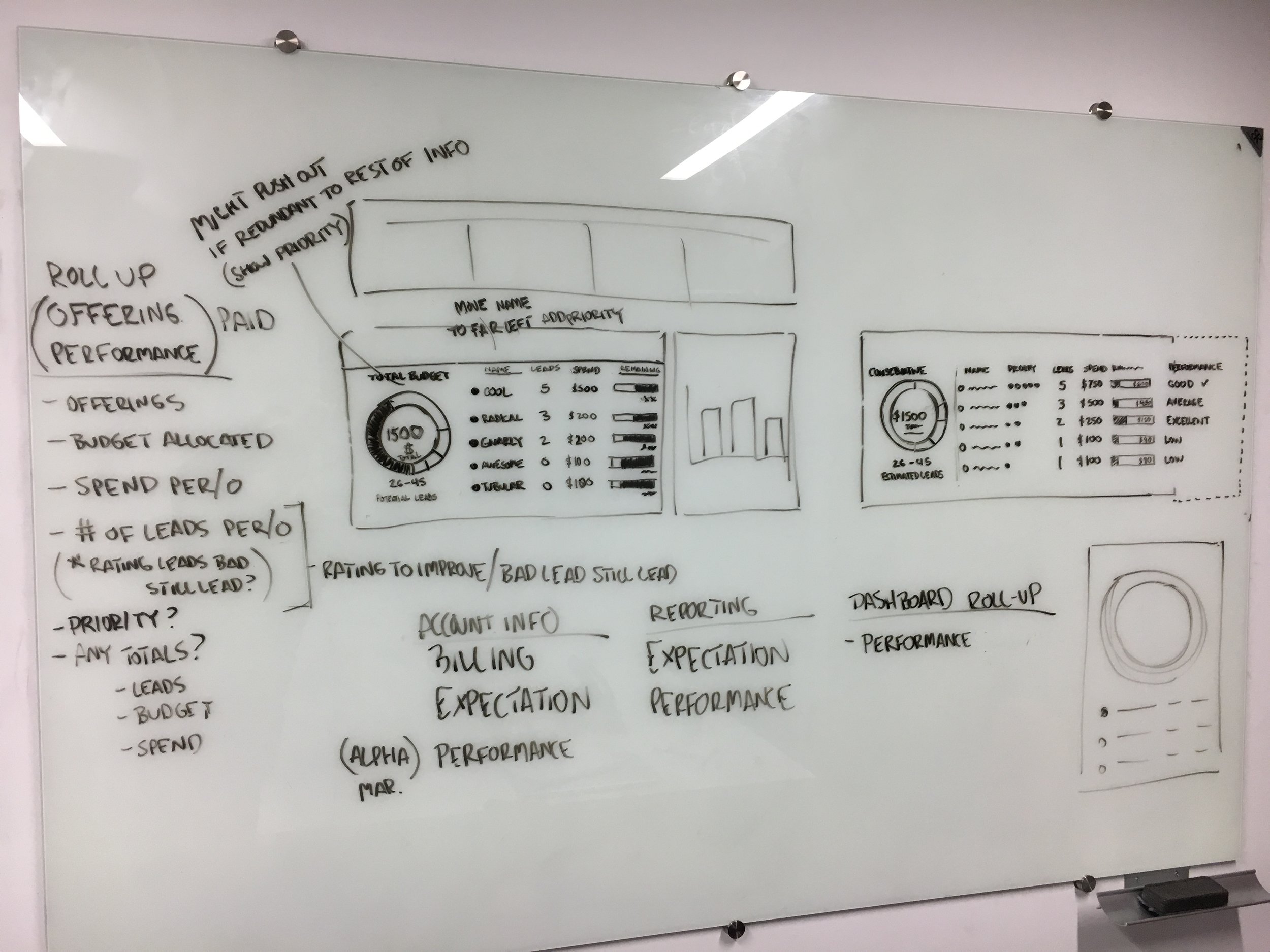
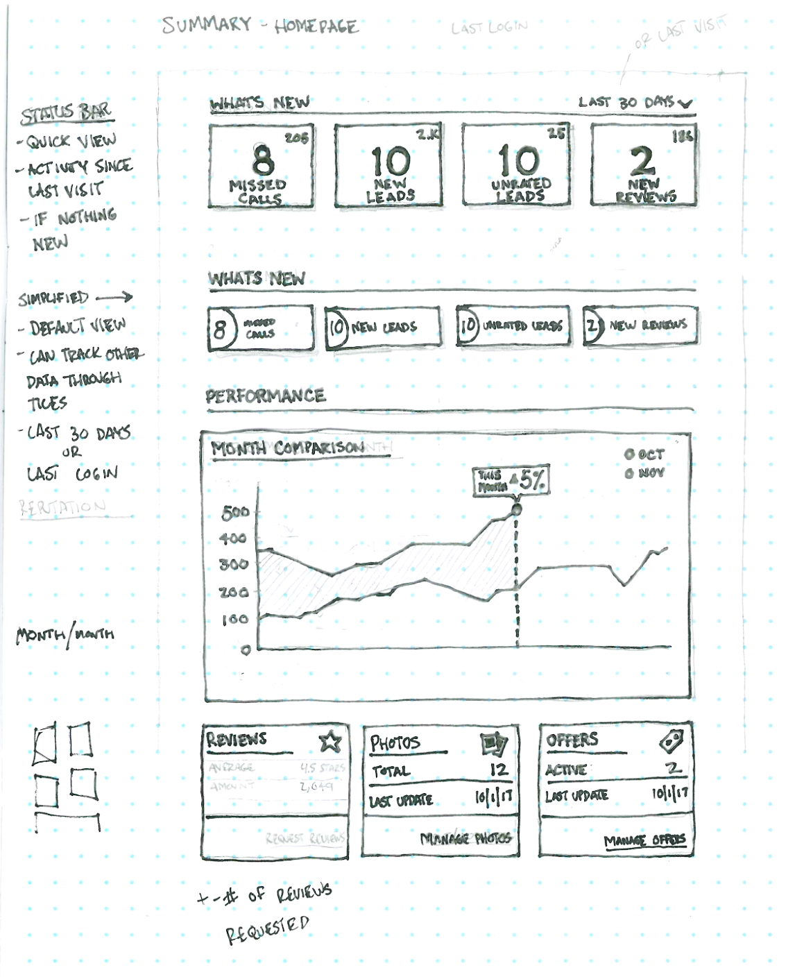
Product Pivot and New Priorities
As we started the new year, our priorities shifted slightly with the Local Business Owner experience. The goal was to get an MVP solution that would satisfy both enterprise franchisee locations and independent local businesses. The dashboard was designed to solve for both use cases, but it was the larger experience we needed to re-architect and evaluate. Our team goal was to help clients “understand value”, focusing on the homepage (dashboard), reporting pages, and information architecture of the experience.
OUTCOME
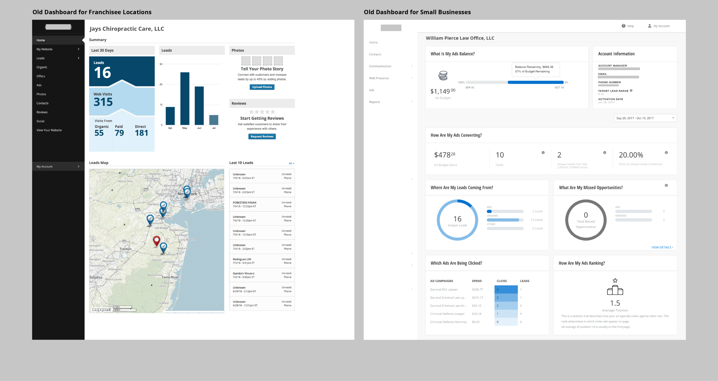
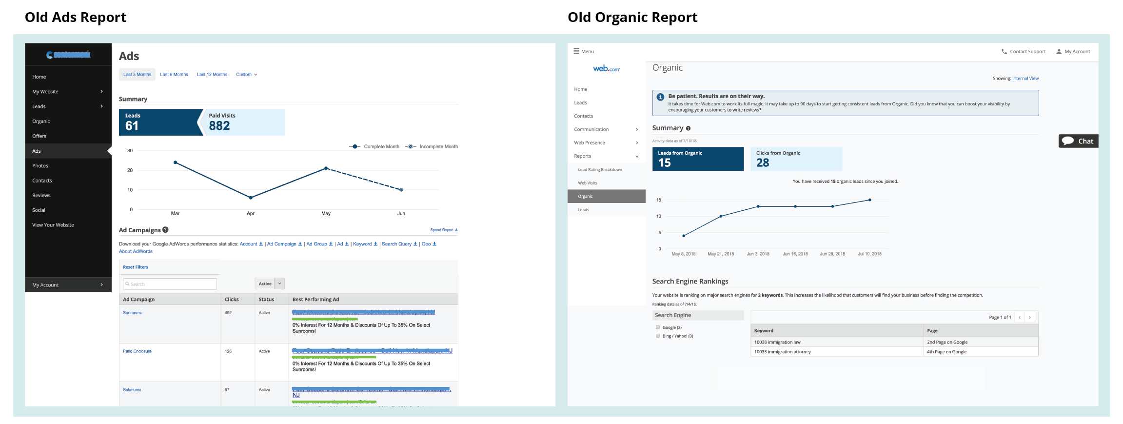
It appeared that the Small Business Dashboard had a simpler navigation but didn’t organize content in a sensible hierarchy, some key pages were sub nav items. The Franchisee location dashboard had a crowded navigation which added complexity to workflows.
From here, I knew there was value in simplifying the navigation hierarchy and evaluating content based on user need and engagement into one
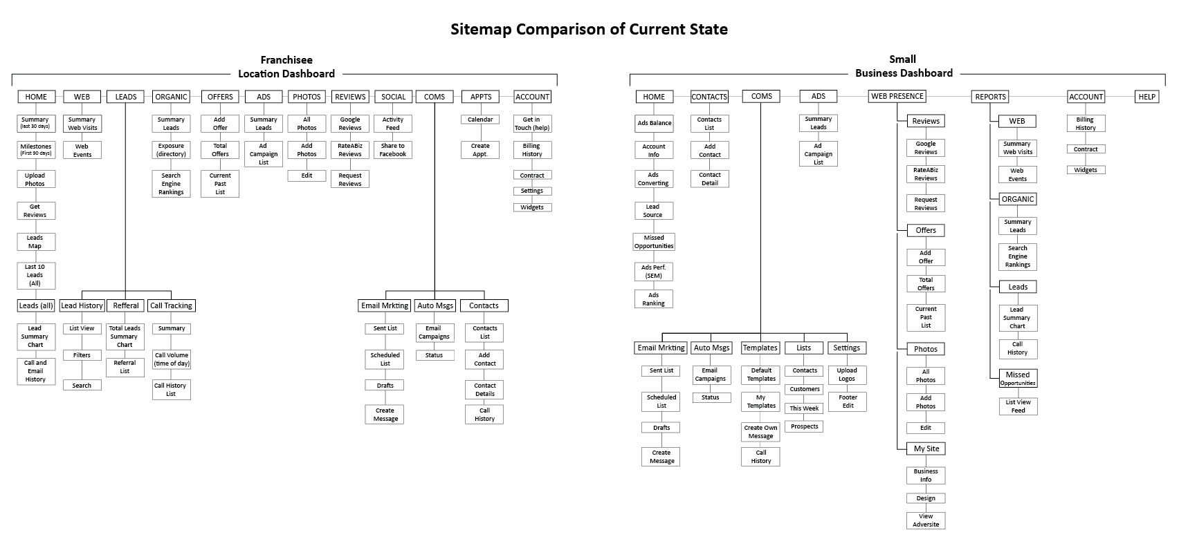
SITEMAP ANALYSIS
I started building sitemaps of both products in their current state. This helped understand where content was nested and the global navigation hierarchy. I color coded pages to visualize what was shared on both products and which pages that were unique to their respective products.
Comparing side by side, they were structured very differently but seemed to share a lot of the same content like web presence and reports.
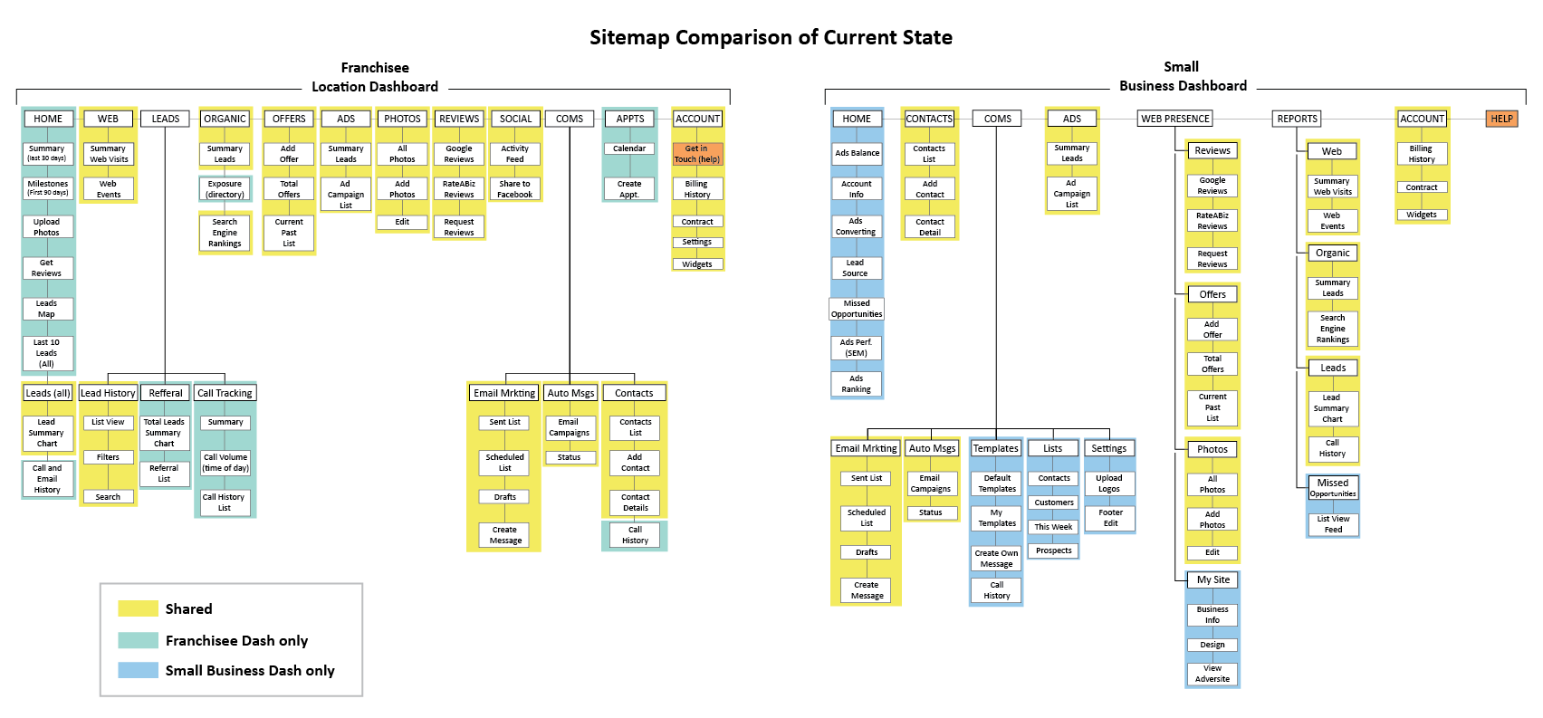
CONTENT AUDIT & SITEMAP REDESIGN


After design review feedback, I started whiteboarding to think about how we could merge the two experiences. Knowing that a bulk of the experience was the same I started with a sitemap modeled after the local business dashboard and looked at outliers of the franchisee location dashboard that I might need to account for.
ENGAGEMENT ASSESSMENT
I first took a look at engagement across the product to get an idea of what pages were being trafficked. It helped give us a sense of priority and the most important pages to focus our redesign on. Pages that had low engagement were flagged for investigation so we could determine if they could be cut. We broke out our strategy into 4 steps:
- New pages to be validated
- Recently redesigned pages
- Pages to audit and/or remove
- Validated pages slated for redesign
CONTENT AUDIT
We started to look at the content we wanted to audit first due to low engagement or potential requirements from the Franchisee local dashboard. We ideated on new pages that would have value but be a heavier lift in terms of vetting and designing from scratch. Next were valued pages that we wanted to redesign with our Design System and test. And of course pages we planned to cut but needed to investigate engagement before removing. This set us up with a strategy to tackle low hanging fruit first, and get to a proposed solution quickly.
FINAL SITEMAP AND DESIGN APPROACH
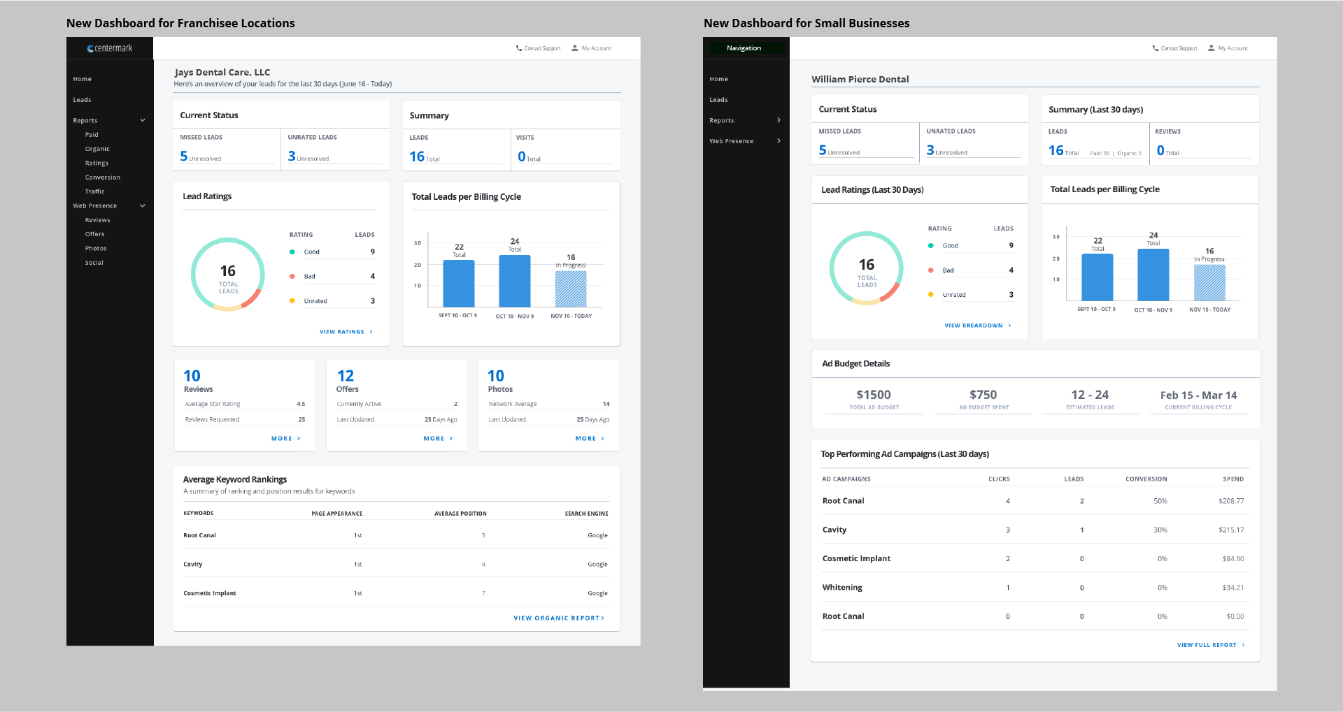
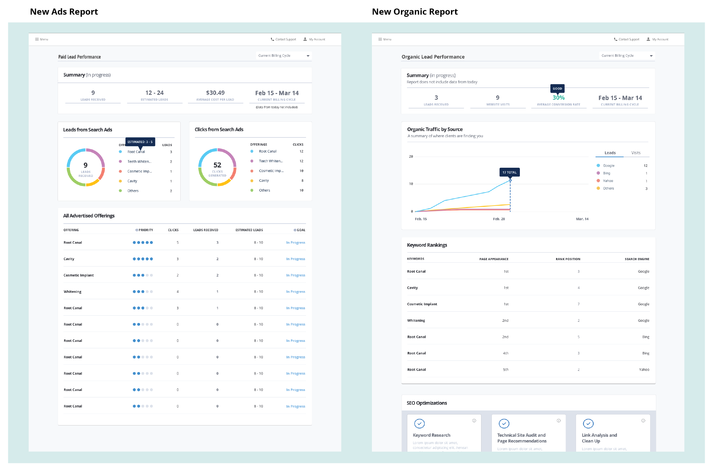
After auditing the content we arrived at a proposed architecture that would satisfy both dashboard needs and be scalable for unique requirements. Pairing down the experience to an essential IA gave us a baseline to work towards and as we tackled the remaining parts of the experience, this served as a status to communicate where we were in the design and development process with product and stakeholders.
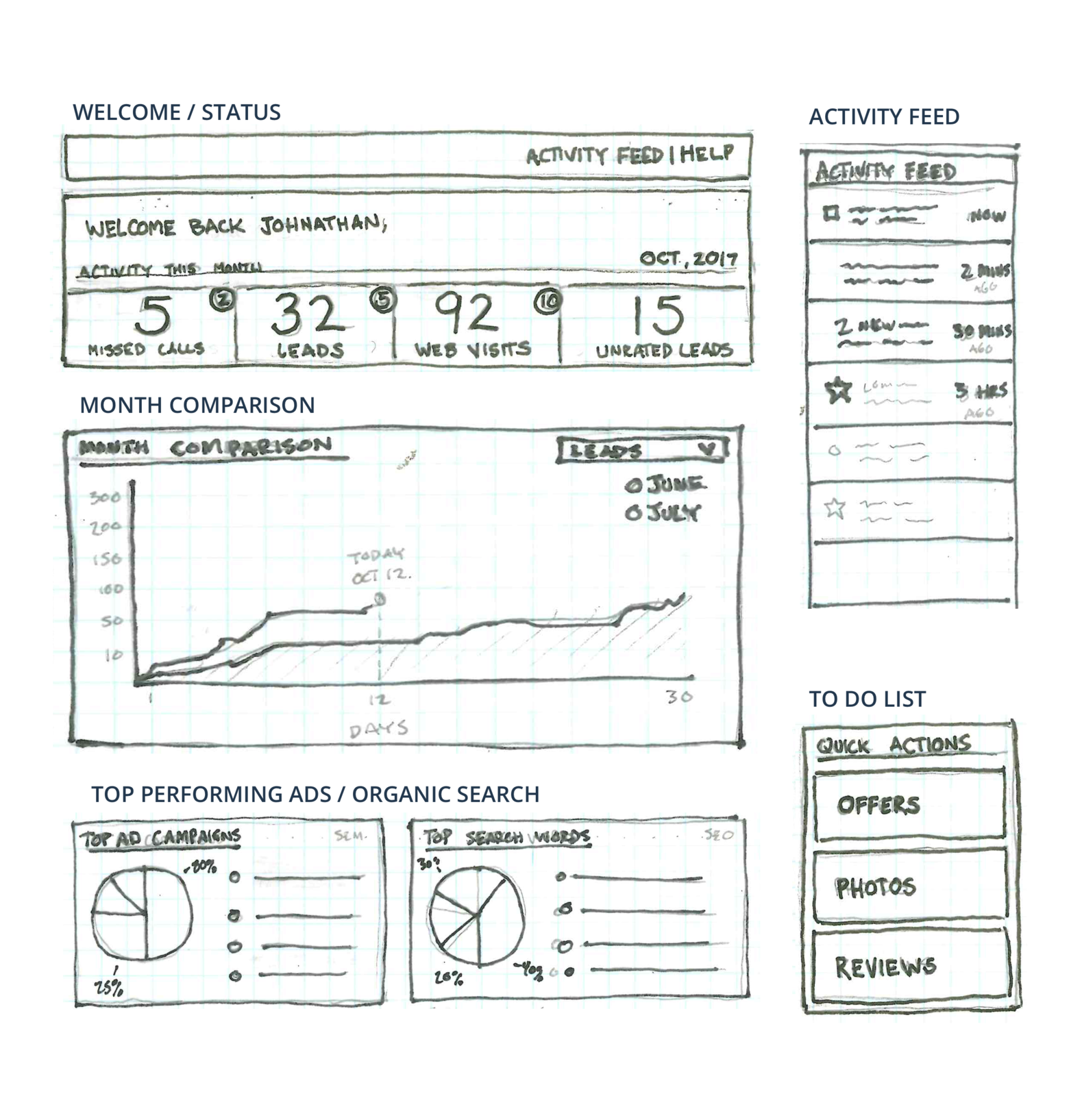
Final Wireframes
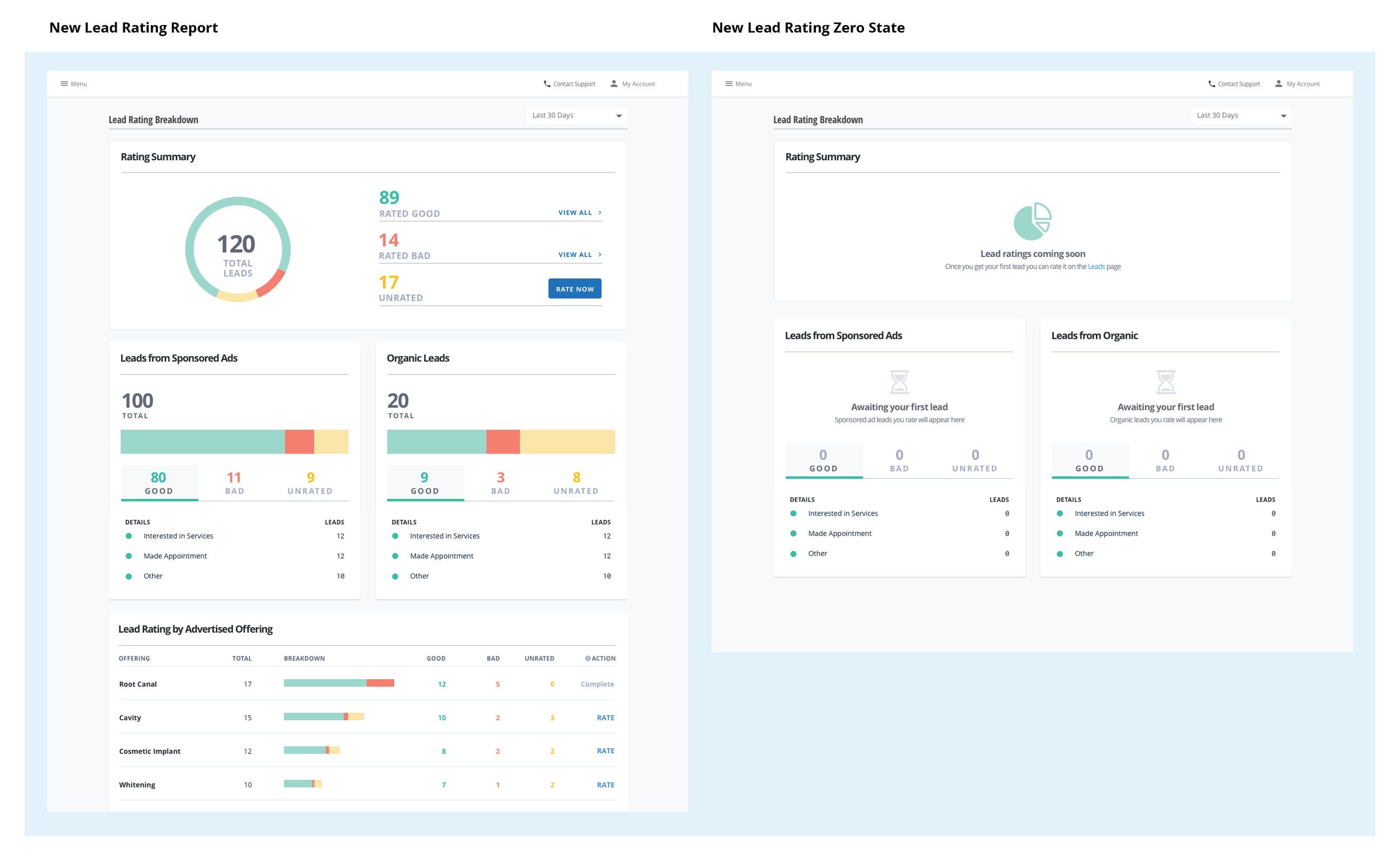
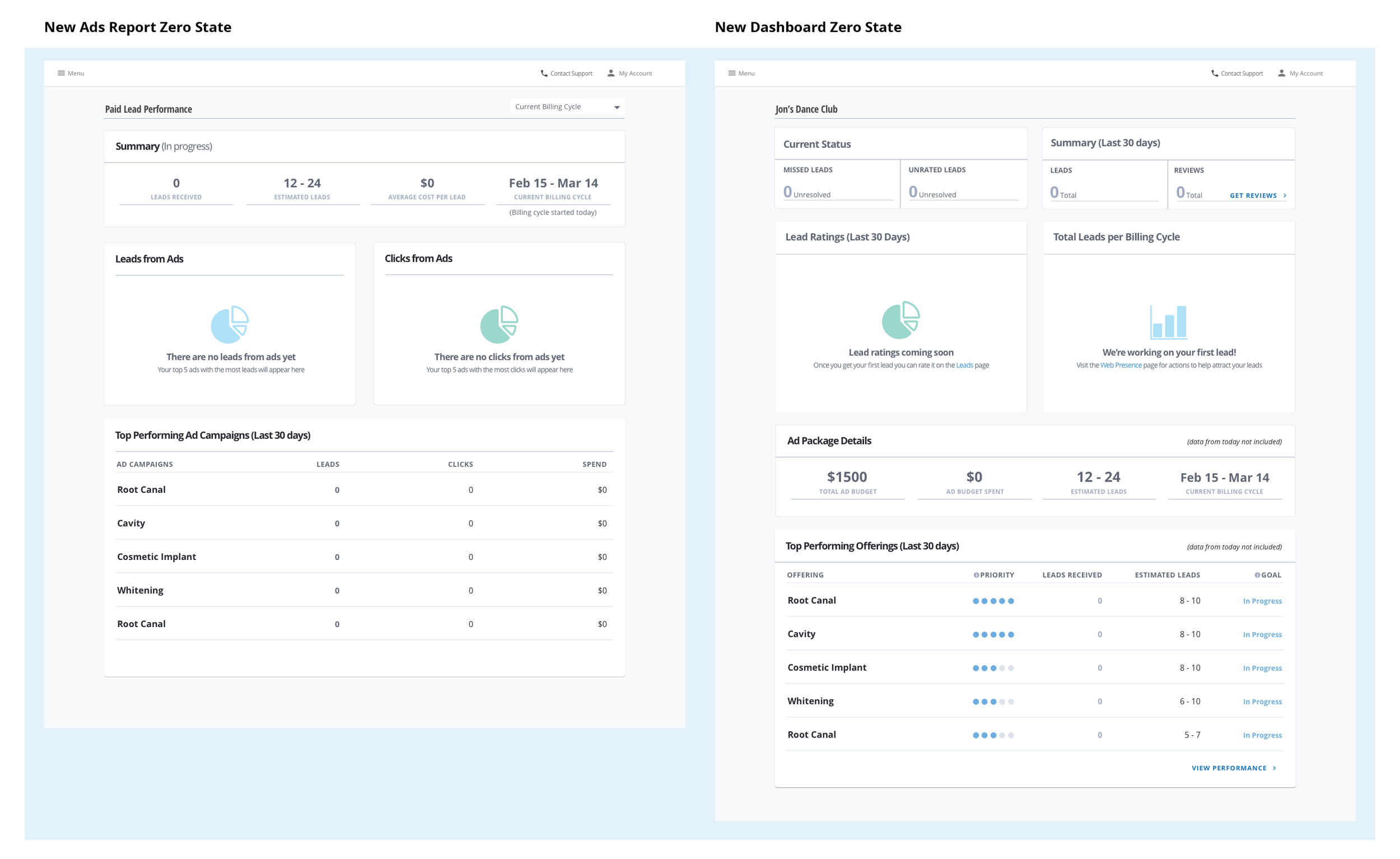
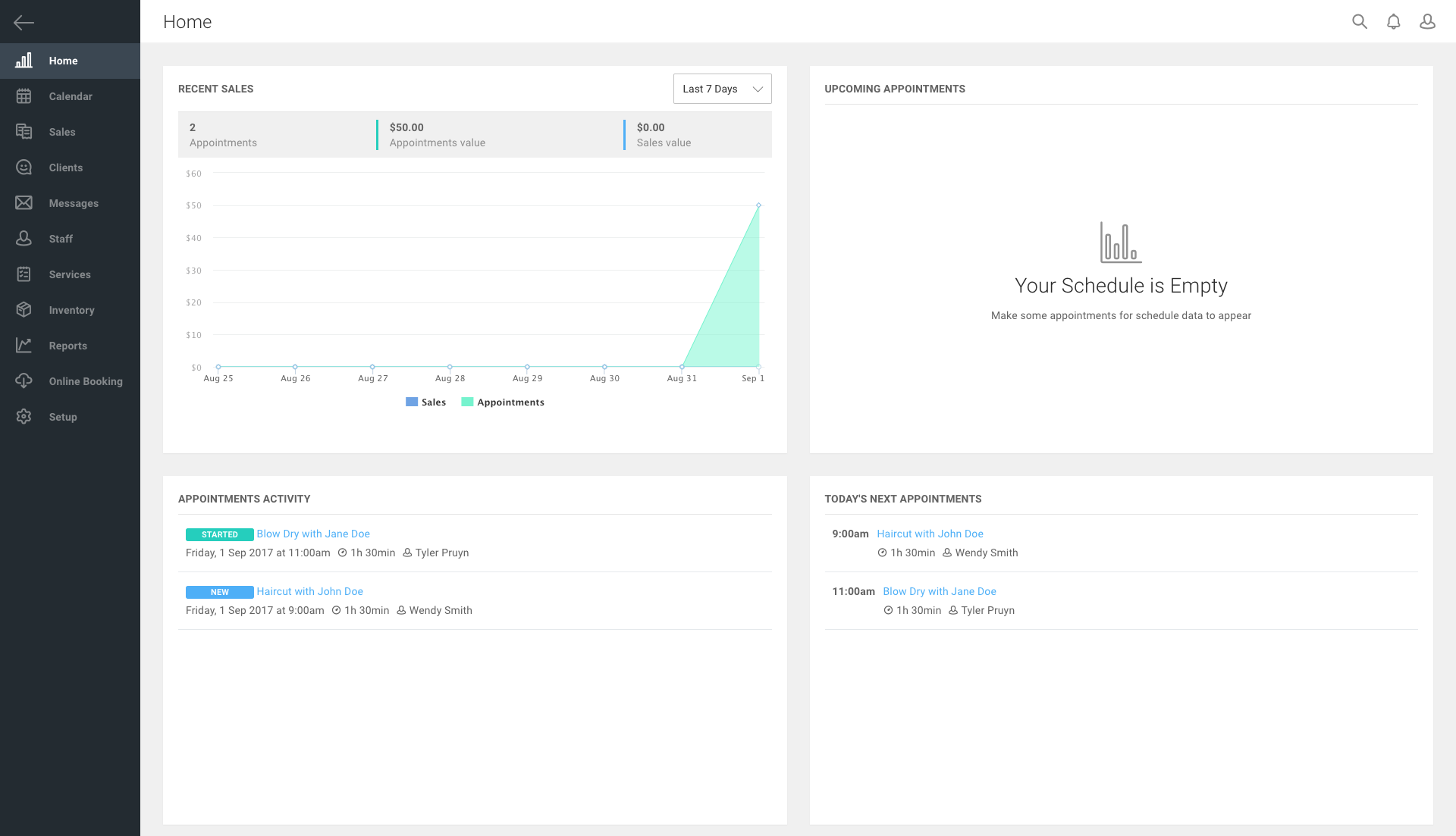
Our release was scheduled for April to new users with our new Ads offering platform, and existing users of the small business dashboard. I was under the gun to make sure we had adequate zero/empty states for new users and onboarding guides for the existing users getting the update. Tracking and onboarding were created in Pendo, using CSS I created a walkthrough of the new features and tagged click zones to track page visits. We saw an increase in engagement with the Homepage and usage of new features like the status bar that would drive users to key pages like leads and missed calls. Below Are all the final wires.